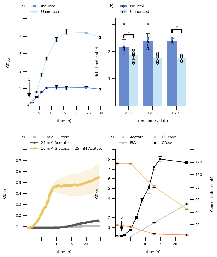
Recreating the Figure from Rong, Frey et al. 2024 about CRISPRi#
create individual plotting functions
combine them into one figure with subplots
Exercise: try to adapt the figure to look nicely
One could keep the notebook along the source data to recreate the figure during future revisions of the manuscript.
import os

import matplotlib as mpl
import matplotlib.pyplot as plt
import numpy as np
import pandas as pd
import seaborn as sns

mpl.rcParams['pdf.fonttype'] = 42
mpl.rcParams['ps.fonttype'] = 42

# global font size (can be set via environment variable FONT_SIZE)
FONT_SIZE = 9
mpl.rcParams['font.size'] = FONT_SIZE
mpl.rcParams["figure.figsize"] = (3.5, 3)

IN_COLAB = "COLAB_GPU" in os.environ
Setup#
Let’s make use of the files
A_DATA_FILE = "figure_2a.csv"
B_DATA_FILE = "figure_2b.csv"
C_DATA_FILE = "figure_2c.csv"
D_DATA_FILE = "figure_2d.csv"

URL_TEMPLATE = (
    "https://raw.githubusercontent.com/biosustain/dsp_workshop_dataviz_python/"
    "refs/heads/main/exercises/CRISPRi/{filename}"
)

if IN_COLAB:
    A_DATA_FILE = URL_TEMPLATE.format(filename="figure_2a.csv")
    B_DATA_FILE = URL_TEMPLATE.format(filename="figure_2b.csv")
    C_DATA_FILE = URL_TEMPLATE.format(filename="figure_2c.csv")
    D_DATA_FILE = URL_TEMPLATE.format(filename="figure_2d.csv")

CONDITION_LIST = ["induced", "uninduced"]
C_VAR_LIST = ["10 mM glucose", "25 mM acetate", "10 mM glucose + 25 mM acetate"]
D_VAR_LIST = ["Acetate (mM)", "IBA (mM)", "Glucose (mM)", "IBA strain - OD600"]

AB_COLORS = ["#5884deff", "#bde7ffff"]
C_COLORS = ["#bdbdbdff", "#585858ff", "#ebc667ff"]
D_COLORS = ["#fe9256ff", "#bdbdbdff", "#ebc663ff", "#000000ff"]
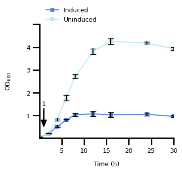
1. Figure 2A#
1.1 Transform The Data#
a_data = pd.read_csv(A_DATA_FILE)
a_data = a_data.melt(id_vars="time (h)", var_name="rep_cond", value_name="od_600")
a_data[["replicate", "condition"]] = a_data["rep_cond"].str.split("_", n=1, expand=True)
a_data["replicate"] = a_data["replicate"].str[-1].astype(int)
a_data["condition"] = pd.Categorical(
    a_data["condition"], categories=CONDITION_LIST, ordered=True
)
1.2 Plot the Dat#
fig, ax = plt.subplots()

# main plot
p = sns.lineplot(
    a_data,
    x="time (h)",
    y="od_600",
    hue="condition",
    errorbar="sd",
    err_style="bars",
    err_kws={"capsize": 4, "ecolor": "black"},
    markers=True,
    marker="s",
    markeredgewidth=0,
    palette=AB_COLORS,
    ax=ax,
)
# restrict plotting area
ax.set_xlim(0, 30)
ax.set_ylim(0, 5)

# define frequency and size of ticks and their labels
ax.set_xticks(range(5, 31, 5), range(5, 31, 5), fontsize=FONT_SIZE)
ax.xaxis.set_tick_params(width=2, length=10)
ax.set_yticks(range(1, 6, 1), [1, 2, 3, 4, ""], fontsize=FONT_SIZE)
ax.yaxis.set_tick_params(width=2, length=10)

# adjust the "frame" of the plot
for pos, lw in zip(["bottom", "left", "top", "right"], [2, 2, 0, 0]):
    ax.spines[pos].set_linewidth(lw)

# set the legend
handles, labels = p.get_legend_handles_labels()
ax.legend(
    handles,
    ["Induced", "Uninduced"],
    title=None,
    loc="upper left",
    bbox_to_anchor=[0.01, 1.2],
    frameon=False,
    fontsize=FONT_SIZE,
)

# make an annotation with arrow to point to timepoint at 1 hour
ax.annotate(
    "1",
    (1, 0.5),
    xytext=(1, 1.5),
    fontsize=FONT_SIZE,
    xycoords="data",
    horizontalalignment="center",
    verticalalignment="center",
    arrowprops={
        "width": 1,
        "headwidth": 8,
        "headlength": 10,
        "color": "black",
    },
)

# set the axis labels
ax.set_xlabel("Time (h)", labelpad=10, fontdict={"size": FONT_SIZE})
ax.set_ylabel("$\\text{OD}_{600}$", labelpad=20, fontdict={"size": FONT_SIZE})
Text(0, 0.5, '$\\text{OD}_{600}$')
2. Figure 2B#
2.1 Transform The Data#
b_data = pd.read_csv(B_DATA_FILE)
b_data = b_data.melt(id_vars="timepoint (h)", var_name="rep_cond", value_name="yield")
b_data[["condition", "replicate"]] = (
    b_data["rep_cond"].str.lower().str.split("_", n=1, expand=True)
)
b_data["replicate"] = b_data["replicate"].str[-1].astype(int)
b_data["condition"] = pd.Categorical(
    b_data["condition"], categories=CONDITION_LIST, ordered=True
)

data_list = []
for _bin, _label in zip([(2, 12), (16,), (30,)], ["2-12", "12-16", "16-30"]):
    df = b_data[b_data["timepoint (h)"].isin(_bin)].copy()
    df["time_interval"] = _label
    data_list.append(df)

b_data = pd.concat(data_list)
2.2 Plot The Data#
fig, ax = plt.subplots()

TOTAL_WIDTH = 0.8
bp = sns.barplot(
    b_data,
    x="time_interval",
    y="yield",
    hue="condition",
    errorbar="sd",
    palette=AB_COLORS,
    capsize=0.2,
    width=TOTAL_WIDTH,
    ax=ax,
)
sns.stripplot(
    b_data,
    x="time_interval",
    y="yield",
    hue="condition",
    edgecolor="black",
    linewidth=1,
    dodge=True,
    jitter=0,
    palette=AB_COLORS,
    ax=ax,
)

# restrict plotting area
ax.set_ylim(0, 3.2)

# define frequency and size of ticks and their labels
ax.xaxis.set_tick_params(width=2, length=10, labelsize=FONT_SIZE)
ax.set_yticks(range(1, 4, 1), [1, 2, ""], fontsize=FONT_SIZE)
ax.yaxis.set_tick_params(width=2, length=10)

# adjust the "frame" of the plot
for pos, lw in zip(["bottom", "left", "top", "right"], [2, 2, 0, 0]):
    ax.spines[pos].set_linewidth(lw)

# set the legend
handles, labels = ax.get_legend_handles_labels()
n_hues = len(CONDITION_LIST)
new_handles = [(handles[i], handles[i + n_hues]) for i in range(n_hues)]
ax.legend_.remove()
ax.legend(
    new_handles,
    ["Induced", "Uninduced"],
    title=None,
    loc="upper left",
    bbox_to_anchor=[0.01, 1.2],
    frameon=False,
    fontsize=FONT_SIZE,
)

# set the axis labels
ax.set_xlabel("Time Interval (h)", labelpad=10, fontdict={"size": FONT_SIZE})
ax.set_ylabel(
    "Yield $\\left( \\text{mol } \\text{mol}^{-1} \\right)$",
    labelpad=20,
    fontdict={"size": FONT_SIZE},
)

# indicate statistical significances
bar_center = TOTAL_WIDTH / 4
sig_height = 0.1
for bar_idx, y_start in zip([0, 2], [2.5, 2.7]):
    x_left = bar_idx - bar_center
    x_right = bar_idx + bar_center
    ax.plot(
        [x_left, x_left, x_right, x_right],
        [y_start, y_start + sig_height, y_start + sig_height, y_start],
        linewidth=3,
        color="black",
    )
    ax.text(
        (x_left + x_right) / 2,
        y_start + sig_height,
        "*",
        horizontalalignment="center",
        verticalalignment="bottom",
        fontsize=FONT_SIZE,
    )
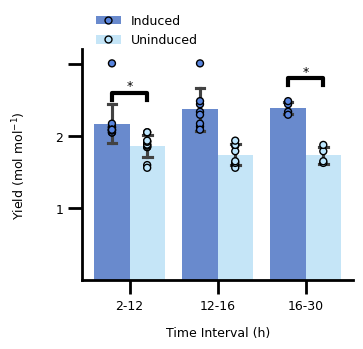
The significance annotation is based on this StackOverflow answer.
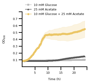
3. Figure 2C#
3.1 Transform The Data#
c_data = pd.read_csv(C_DATA_FILE, header=[0, 1], index_col=0)
c_data.columns.names = ["variable", "measurement"]
c_data.index.name = "time (h)"
c_data = c_data.stack(level="variable", future_stack=True).reset_index()
c_data["variable"] = pd.Categorical(
    c_data["variable"], categories=C_VAR_LIST, ordered=True
)
c_data["od_lower"] = c_data["od600"] - c_data["stdev"]
c_data["od_upper"] = c_data["od600"] + c_data["stdev"]
3.2 Plot The Data#
fig, ax = plt.subplots()

# main plot
p = sns.lineplot(
    c_data,
    x="time (h)",
    y="od600",
    hue="variable",
    style="variable",
    markers=["s", "^", "o"],
    markersize=6,
    markeredgewidth=0,
    errorbar=None,
    dashes={var: "" for var in C_VAR_LIST},
    palette=C_COLORS,
    ax=ax,
)

# plot the standard deviation as a shaded area
lower = sns.lineplot(
    c_data,
    x="time (h)",
    y="od_lower",
    hue="variable",
    errorbar=None,
    palette=C_COLORS,
    linewidth=0,
    ax=ax,
)
upper = sns.lineplot(
    c_data,
    x="time (h)",
    y="od_upper",
    hue="variable",
    errorbar=None,
    palette=C_COLORS,
    linewidth=0,
    ax=ax,
)
lines = p.get_lines()
for line_idx in range(3):
    ax.fill_between(
        lines[line_idx].get_xdata(),
        lines[line_idx + 6].get_ydata(),
        lines[line_idx + 6 * 2].get_ydata(),
        color=C_COLORS[line_idx],
        alpha=0.2,
    )

# restrict plotting area
ax.set_xlim(0, 25)
ax.set_ylim(0, 0.8)

# define frequency and size of ticks and their labels
ax.set_xticks(range(5, 26, 5), list(range(5, 26, 5))[:-1] + [""], fontsize=FONT_SIZE)
ax.xaxis.set_tick_params(width=2, length=10)
y_tick_labels = np.round(np.linspace(0.1, 0.8, 8), 1)
ax.set_yticks(y_tick_labels, y_tick_labels.tolist()[:-1] + [""], fontsize=FONT_SIZE)
ax.yaxis.set_tick_params(width=2, length=10)

# adjust the "frame" of the plot
for pos, lw in zip(["bottom", "left", "top", "right"], [2, 2, 0, 0]):
    ax.spines[pos].set_linewidth(lw)

# set the legend
handles, labels = p.get_legend_handles_labels()
ax.legend(
    handles,
    ["10 mM Glucose", "25 mM Acetate", "10 mM Glucose + 25 mM Acetate"],
    title=None,
    loc="upper left",
    bbox_to_anchor=[0.01, 1.2],
    frameon=False,
    fontsize=FONT_SIZE,
)

# set the axis labels
ax.set_xlabel("Time (h)", labelpad=10, fontdict={"size": FONT_SIZE})
ax.set_ylabel("$\\text{OD}_{600}$", labelpad=20, fontdict={"size": FONT_SIZE})
Text(0, 0.5, '$\\text{OD}_{600}$')
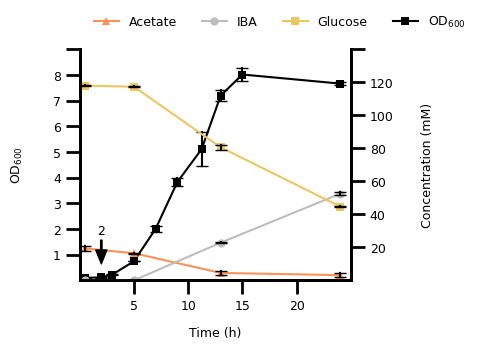
4. Figure 2D#
4.1 Transform The Data#
d_data = pd.read_csv(D_DATA_FILE, header=[0, 1], index_col=0)
d_data.columns.names = ["variable", "replicate"]
d_data.index.name = "time (h)"
d_data = (
    d_data.stack(level="variable", future_stack=True)
    .reset_index()
    .dropna()
    .melt(id_vars=["time (h)", "variable"], var_name="replicate", value_name="conc_od")
)
d_data["variable"] = pd.Categorical(
    d_data["variable"], categories=D_VAR_LIST, ordered=True
)
4.2 Plot The Data#
fig, ax1 = plt.subplots()

# first of variables with millimolar unit
p1 = sns.lineplot(
    d_data[(d_data["variable"].str.contains("OD")) & (d_data["time (h)"] <= 25)],
    x="time (h)",
    y="conc_od",
    hue="variable",
    errorbar="sd",
    err_style="bars",
    err_kws={"capsize": 4, "ecolor": "black"},
    markers=True,
    marker="s",
    markersize=6,
    markeredgewidth=0,
    palette=D_COLORS,
    ax=ax1,
)
ax1.set_xlim(0, 25)
ax1.set_ylim(0, 9)

# OD600 plot
ax2 = ax1.twinx()
p2 = sns.lineplot(
    d_data[~d_data["variable"].str.contains("OD")],
    x="time (h)",
    y="conc_od",
    hue="variable",
    errorbar="sd",
    err_style="bars",
    err_kws={"capsize": 4, "ecolor": "black"},
    style="variable",
    markers=["^", "o", "s", "s"],
    markersize=6,
    markeredgewidth=0,
    dashes={var: "" for var in D_VAR_LIST},
    palette=D_COLORS,
    ax=ax2,
)
ax2.set_ylim(0, 130)

# define frequency and size of ticks and their labels
ax1.set_xticks(range(5, 25, 5), range(5, 25, 5), fontsize=FONT_SIZE)
ax1.xaxis.set_tick_params(width=2, length=10)
ax1.set_yticks(range(1, 10, 1), list(range(1, 10, 1))[:-1] + [""], fontsize=FONT_SIZE)
ax1.yaxis.set_tick_params(width=2, length=10)
ax2.set_yticks(range(20, 141, 20), list(range(20, 141, 20))[:-1] + [""], fontsize=FONT_SIZE)
ax2.yaxis.set_tick_params(width=2, length=10)

# adjust the "frame" of the plot
for pos, lw in zip(["bottom", "left", "top", "right"], [2, 2, 0, 2]):
    ax1.spines[pos].set_linewidth(lw)
    ax2.spines[pos].set_linewidth(lw)

# set the legend
handles1, labels1 = p1.get_legend_handles_labels()
handles2, labels2 = p2.get_legend_handles_labels()
ax2.legend_.remove()
ax1.legend(
    handles2 + [handles1[-1]],
    ["Acetate", "IBA", "Glucose", "$\\text{OD}_{600}$"],
    ncol=4,
    title=None,
    loc="upper left",
    bbox_to_anchor=[0.01, 1.2],
    frameon=False,
    fontsize=FONT_SIZE,
)

# make an annotation with arrow to point to timepoint at 1 hour
ax2.annotate(
    "2",
    (2, 10),
    xytext=(2, 30),
    fontsize=FONT_SIZE,
    xycoords="data",
    horizontalalignment="center",
    verticalalignment="center",
    arrowprops={
        "width": 1,
        "headwidth": 8,
        "headlength": 10,
        "color": "black",
    },
)

# set the axis labels
ax1.set_xlabel("Time (h)", labelpad=10, fontdict={"size": FONT_SIZE})
ax2.set_ylabel("Concentration (mM)", labelpad=20, fontdict={"size": FONT_SIZE})
ax1.set_ylabel("$\\text{OD}_{600}$", labelpad=20, fontdict={"size": FONT_SIZE})
Text(0, 0.5, '$\\text{OD}_{600}$')
5. Everything Together#
Alternatively, you could combine the four individual plots into one figure with subplots above (try if you want).
5.1 Define Functions for Each Individual Plot#
def figure_a(a_data: pd.DataFrame, ax: plt.Axes):
    # main plot
    p = sns.lineplot(
        a_data,
        x="time (h)",
        y="od_600",
        hue="condition",
        errorbar="sd",
        err_style="bars",
        err_kws={"capsize": 4, "ecolor": "black"},
        markers=True,
        marker="s",
        markeredgewidth=0,
        palette=AB_COLORS,
        ax=ax,
    )
    # restrict plotting area
    ax.set_xlim(0, 30)
    ax.set_ylim(0, 5)

    # define frequency and size of ticks and their labels
    ax.set_xticks(range(5, 31, 5), range(5, 31, 5), fontsize=FONT_SIZE)
    ax.xaxis.set_tick_params(width=2, length=10)
    ax.set_yticks(range(1, 6, 1), [1, 2, 3, 4, ""], fontsize=FONT_SIZE)
    ax.yaxis.set_tick_params(width=2, length=10)

    # adjust the "frame" of the plot
    for pos, lw in zip(["bottom", "left", "top", "right"], [2, 2, 0, 0]):
        ax.spines[pos].set_linewidth(lw)

    # set the legend
    handles, labels = p.get_legend_handles_labels()
    ax.legend(
        handles,
        ["Induced", "Uninduced"],
        title=None,
        loc="upper left",
        bbox_to_anchor=[0.01, 1.2],
        frameon=False,
        fontsize=FONT_SIZE,
    )

    # make an annotation with arrow to point to timepoint at 1 hour
    ax.annotate(
        "1",
        (1, 0.5),
        xytext=(1, 1.5),
        fontsize=FONT_SIZE,
        xycoords="data",
        horizontalalignment="center",
        verticalalignment="center",
        arrowprops={
            "width": 1,
            "headwidth": 8,
            "headlength": 10,
            "color": "black",
        },
    )

    # set the axis labels
    ax.set_xlabel("Time (h)", labelpad=10, fontdict={"size": FONT_SIZE})
    ax.set_ylabel("$\\text{OD}_{600}$", labelpad=20, fontdict={"size": FONT_SIZE})
def figure_b(b_data: pd.DataFrame, ax: plt.Axes):
    total_width = 0.8
    ax = sns.barplot(
        b_data,
        x="time_interval",
        y="yield",
        hue="condition",
        errorbar="sd",
        palette=AB_COLORS,
        capsize=0.2,
        width=total_width,
        ax=ax,
    )
    sns.stripplot(
        b_data,
        x="time_interval",
        y="yield",
        hue="condition",
        edgecolor="black",
        linewidth=1,
        dodge=True,
        jitter=0,
        palette=AB_COLORS,
        ax=ax,
    )

    # restrict plotting area
    ax.set_ylim(0, 3.2)

    # define frequency and size of ticks and their labels
    ax.xaxis.set_tick_params(width=2, length=10, labelsize=FONT_SIZE)
    ax.set_yticks(range(1, 4, 1), [1, 2, ""], fontsize=FONT_SIZE)
    ax.yaxis.set_tick_params(width=2, length=10)

    # adjust the "frame" of the plot
    for pos, lw in zip(["bottom", "left", "top", "right"], [2, 2, 0, 0]):
        ax.spines[pos].set_linewidth(lw)

    # set the legend
    handles, labels = ax.get_legend_handles_labels()
    n_hues = len(CONDITION_LIST)
    new_handles = [(handles[i], handles[i + n_hues]) for i in range(n_hues)]
    ax.legend_.remove()
    ax.legend(
        new_handles,
        ["Induced", "Uninduced"],
        title=None,
        loc="upper left",
        bbox_to_anchor=[0.01, 1.2],
        frameon=False,
        fontsize=FONT_SIZE,
    )

    # set the axis labels
    ax.set_xlabel("Time Interval (h)", labelpad=10, fontdict={"size": FONT_SIZE})
    ax.set_ylabel(
        "Yield $\\left( \\text{mol } \\text{mol}^{-1} \\right)$",
        labelpad=20,
        fontdict={"size": FONT_SIZE},
    )

    # indicate statistical significances
    bar_center = total_width / 4
    sig_height = 0.1
    for bar_idx, y_start in zip([0, 2], [2.5, 2.7]):
        x_left = bar_idx - bar_center
        x_right = bar_idx + bar_center
        ax.plot(
            [x_left, x_left, x_right, x_right],
            [y_start, y_start + sig_height, y_start + sig_height, y_start],
            linewidth=3,
            color="black",
        )
        ax.text(
            (x_left + x_right) / 2,
            y_start + sig_height,
            "*",
            horizontalalignment="center",
            verticalalignment="bottom",
            fontsize=FONT_SIZE,
        )
def figure_c(c_data: pd.DataFrame, ax: plt.Axes):
    # main plot
    p = sns.lineplot(
        c_data,
        x="time (h)",
        y="od600",
        hue="variable",
        style="variable",
        markers=["s", "^", "o"],
        markersize=6,
        markeredgewidth=0,
        errorbar=None,
        dashes={var: "" for var in C_VAR_LIST},
        palette=C_COLORS,
        ax=ax,
    )

    # plot the standard deviation as a shaded area
    lower = sns.lineplot(
        c_data,
        x="time (h)",
        y="od_lower",
        hue="variable",
        errorbar=None,
        palette=C_COLORS,
        linewidth=0,
        ax=ax,
    )
    upper = sns.lineplot(
        c_data,
        x="time (h)",
        y="od_upper",
        hue="variable",
        errorbar=None,
        palette=C_COLORS,
        linewidth=0,
        ax=ax,
    )
    lines = p.get_lines()
    for line_idx in range(3):
        ax.fill_between(
            lines[line_idx].get_xdata(),
            lines[line_idx + 6].get_ydata(),
            lines[line_idx + 6 * 2].get_ydata(),
            color=C_COLORS[line_idx],
            alpha=0.2,
        )

    # restrict plotting area
    ax.set_xlim(0, 25)
    ax.set_ylim(0, 0.8)

    # define frequency and size of ticks and their labels
    ax.set_xticks(range(5, 26, 5), list(range(5, 26, 5))[:-1] + [""], fontsize=FONT_SIZE)
    ax.xaxis.set_tick_params(width=2, length=10)
    y_tick_labels = np.round(np.linspace(0.1, 0.8, 8), 1)
    ax.set_yticks(y_tick_labels, y_tick_labels.tolist()[:-1] + [""], fontsize=FONT_SIZE)
    ax.yaxis.set_tick_params(width=2, length=10)

    # adjust the "frame" of the plot
    for pos, lw in zip(["bottom", "left", "top", "right"], [2, 2, 0, 0]):
        ax.spines[pos].set_linewidth(lw)

    # set the legend
    handles, labels = p.get_legend_handles_labels()
    ax.legend(
        handles,
        ["10 mM Glucose", "25 mM Acetate", "10 mM Glucose + 25 mM Acetate"],
        title=None,
        loc="upper left",
        bbox_to_anchor=[0.01, 1.2],
        frameon=False,
        fontsize=FONT_SIZE,
    )

    # set the axis labels
    ax.set_xlabel("Time (h)", labelpad=10, fontdict={"size": FONT_SIZE})
    ax.set_ylabel("$\\text{OD}_{600}$", labelpad=20, fontdict={"size": FONT_SIZE})
def figure_d(d_data: pd.DataFrame, ax: plt.Axes):
    # first of variables with millimolar unit
    p1 = sns.lineplot(
        d_data[(d_data["variable"].str.contains("OD")) & (d_data["time (h)"] <= 25)],
        x="time (h)",
        y="conc_od",
        hue="variable",
        errorbar="sd",
        err_style="bars",
        err_kws={"capsize": 4, "ecolor": "black"},
        markers=True,
        marker="s",
        markersize=6,
        markeredgewidth=0,
        palette=D_COLORS,
        ax=ax,
    )
    ax.set_xlim(0, 25)
    ax.set_ylim(0, 9)

    # OD600 plot
    ax2 = ax.twinx()
    p2 = sns.lineplot(
        d_data[~d_data["variable"].str.contains("OD")],
        x="time (h)",
        y="conc_od",
        hue="variable",
        errorbar="sd",
        err_style="bars",
        err_kws={"capsize": 4, "ecolor": "black"},
        style="variable",
        markers=["^", "o", "s", "s"],
        markersize=6,
        markeredgewidth=0,
        dashes={var: "" for var in D_VAR_LIST},
        palette=D_COLORS,
        ax=ax2,
    )
    ax2.set_ylim(0, 130)

    # define frequency and size of ticks and their labels
    ax.set_xticks(range(5, 25, 5), range(5, 25, 5), fontsize=FONT_SIZE)
    ax.xaxis.set_tick_params(width=2, length=10)
    ax.set_yticks(range(1, 10, 1), list(range(1, 10, 1))[:-1] + [""], fontsize=FONT_SIZE)
    ax.yaxis.set_tick_params(width=2, length=10)
    ax2.set_yticks(
        range(20, 141, 20), list(range(20, 141, 20))[:-1] + [""], fontsize=FONT_SIZE
    )
    ax2.yaxis.set_tick_params(width=2, length=10)

    # adjust the "frame" of the plot
    for pos, lw in zip(["bottom", "left", "top", "right"], [2, 2, 0, 2]):
        ax.spines[pos].set_linewidth(lw)
        ax2.spines[pos].set_linewidth(lw)

    # set the legend
    handles1, labels1 = p1.get_legend_handles_labels()
    handles2, labels2 = p2.get_legend_handles_labels()
    ax2.legend_.remove()
    ax.legend(
        handles2 + [handles1[-1]],
        ["Acetate", "IBA", "Glucose", "$\\text{OD}_{600}$"],
        ncol=2,
        title=None,
        loc="upper left",
        bbox_to_anchor=[0.01, 1.2],
        frameon=False,
        fontsize=FONT_SIZE,
    )

    # make an annotation with arrow to point to timepoint at 1 hour
    ax2.annotate(
        "2",
        (2, 10),
        xytext=(2, 30),
        fontsize=FONT_SIZE,
        xycoords="data",
        horizontalalignment="center",
        verticalalignment="center",
        arrowprops={
            "width": 1,
            "headwidth": 8,
            "headlength": 10,
            "color": "black",
        },
    )

    # set the axis labels
    ax.set_xlabel("Time (h)", labelpad=10, fontdict={"size": FONT_SIZE})
    ax2.set_ylabel("Concentration (mM)", labelpad=20, fontdict={"size": FONT_SIZE})
    ax.set_ylabel("$\\text{OD}_{600}$", labelpad=20, fontdict={"size": FONT_SIZE})
5.2 Combine All Subplots#
set the figure size to the maximum allowd in Nature Communications.
should probably be smaller
text elements need to be adjusted
fig = plt.figure(
    figsize=(7.2, 9.7),
    constrained_layout=False,
)

gs = fig.add_gridspec(2, 2)

for i, (label, _df, plot_fun) in enumerate(
    zip(
        ["a)", "b)", "c)", "d)"],
        [a_data, b_data, c_data, d_data],
        [figure_a, figure_b, figure_c, figure_d],
    )
):
    ax = fig.add_subplot(gs[i])
    plot_fun(_df, ax)
    ax.set_title(label, fontsize=FONT_SIZE, x=-0.05, y=1.1)

plt.subplots_adjust(hspace=0.5)
plt.show()
Strategy to layout figure#
How would you approach laying out the figure?
Click to see some hints
1. Adjust the individual plots to roughly the correct size 2. Adapt the default font sizes for axes labels, ticks, legends, and titlesYou might want to look into using relative size w.r.t to the default font size, e.g.,
FONT_SIZE = 9
mpl.rcParams['font.size'] = FONT_SIZE
mpl.rcParams['fig.labelsize'] = FONT_SIZE
mpl.font_manager.font_scalings
which gives you the following scaling factors:
{
 'xx-small': 0.579,
 'x-small':  0.694,
 'small':    0.833,
 'medium':   1.0,
 'large':    1.2,
 'x-large':  1.44,
 'xx-large': 1.728,
  None:      1.0
}
meaning that setting to fontsize=None or fontsize='medium' result in using FONT_SIZE, i.e. 9 points.
If you prefer exact point sizes in integer, you can also do this manually, e.g. using
fontsize=FONT_SIZE - 1 for tick labels, fontsize=FONT_SIZE + 1 for axis labels,
and fontsize=FONT_SIZE + 5 for titles (you need to play with it).