4.10 Detecting Outliers
The PCA above uses only the top 500 most variable genes (DESeq2 default). Here we run PCA on the full VST matrix and inspect a scree plot and biplot to assess whether any single sample drives an unusual amount of variance, a common sign of a technical outlier.
pca_full <- prcomp(t(assay(vsd)))

screeplot <- fviz_screeplot(pca_full, addlabels = TRUE,
               main = "Scree plot — variance per PC")
screeplot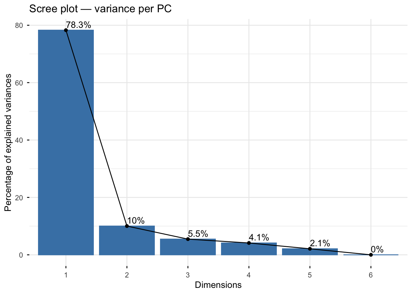
pca_ind <- fviz_pca_ind(pca_full, geom = c("point", "text"), repel = TRUE,
             title = "PCA — sample positions (full gene matrix)")
pca_ind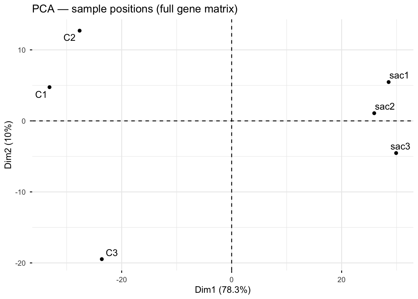
pca_biplot <- fviz_pca_biplot(pca_full,
                repel        = TRUE,
                select.var   = list(contrib = 50),  # top  genes only
                title        = "Biplot — top 50 contributing genes and samples",
                col.var      = "#92C5DE",
                col.ind      = "black")

pca_biplot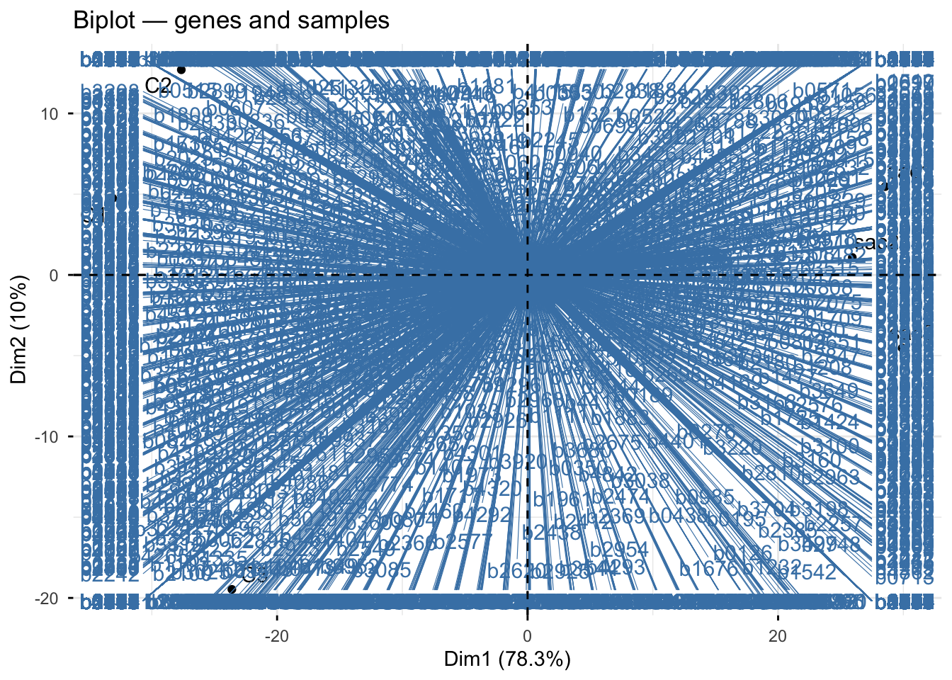
ggsave(
  filename = file.path(git_root, "results", "plots", "pca_screeplot.png"),
  plot     = screeplot,
  width    = 8,
  height   = 6,
  dpi      = 300
)

ggsave(
  filename = file.path(git_root, "results", "plots", "pca_individuals.png"),
  plot     = pca_ind,
  width    = 8,
  height   = 6,
  dpi      = 300
)

ggsave(
  filename = file.path(git_root, "results", "plots", "pca_biplot.png"),
  plot     = pca_biplot,
  width    = 8,
  height   = 6,
  dpi      = 300
)
How to read a biplot:
Dots = samples (C1, C2, C3, sac1, sac2, sac3)
Arrows/lines = genes — the direction shows which samples that gene is highly expressed in, and the length shows how strongly it contributes to the PC:
- Genes pointing right → higher expression in treatment
- Genes pointing left → higher expression in control
- Genes pointing up/down → contribute more to PC2 (within-condition variation)
- Genes near the centre → contribute little to either PC
What to look for:
- Genes with long arrows along PC1 are your strongest candidates for driving the treatment response — these are likely to appear as significant DE genes
- If many arrows point in the same direction, it suggests coordinated regulation (a pathway-level response)
- A gene pointing toward C3 specifically (along PC2) would explain the C3 separation flagged in the PCA and heatmap