5.5 Visualisation
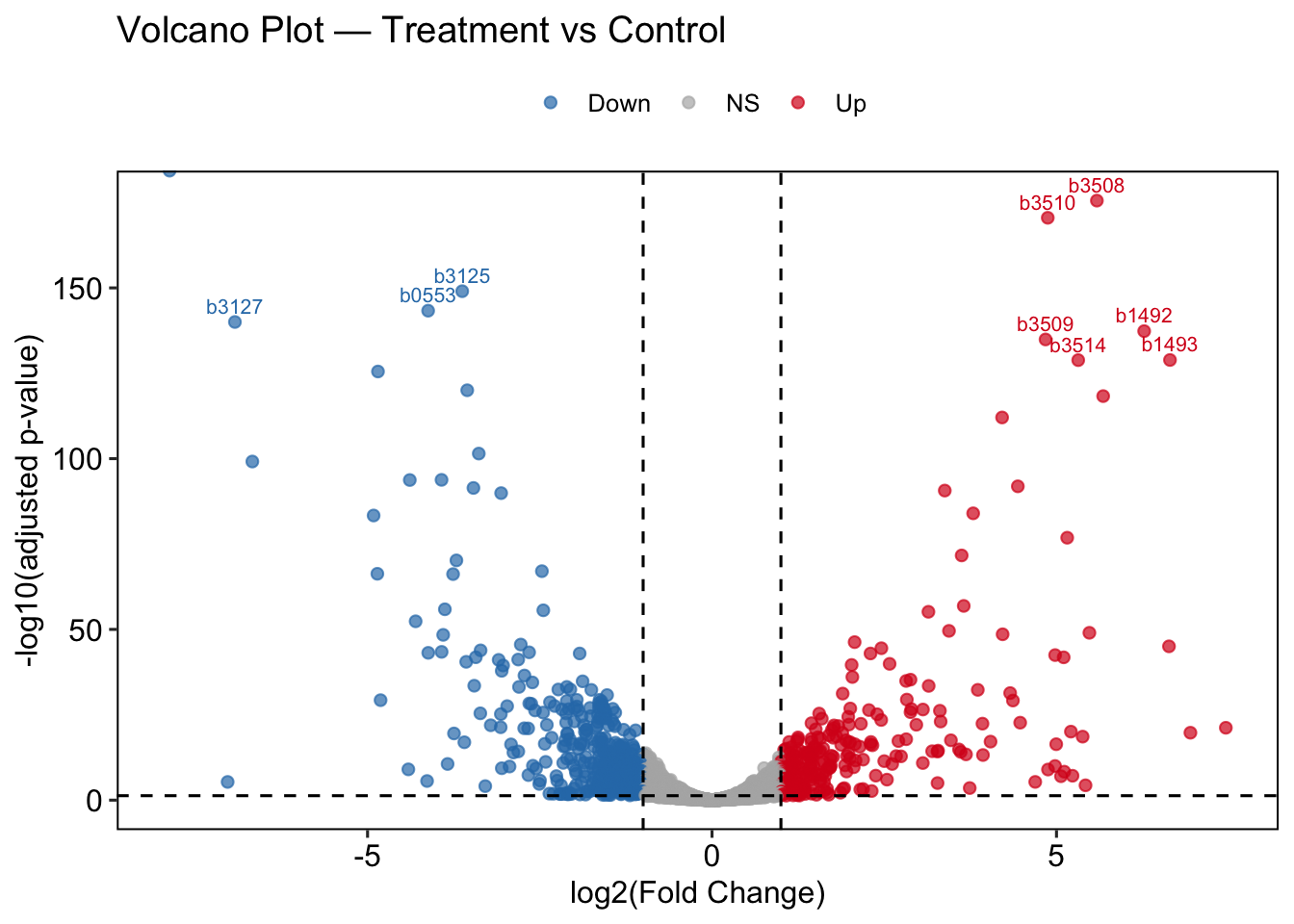
Volcano Plot
A volcano plot combines fold change (x-axis) and statistical significance (y-axis) into a single view. Genes in the upper corners are both strongly and significantly changed — these are the most biologically interesting candidates.
The dashed lines mark our thresholds: |log2FC| = 1 and padj = 0.05.
cols_condition <- c("control"   = "#2c7bb6",
                    "treatment" = "#d7191c")

res_df <- res_df %>%
  mutate(
    significance = case_when(
      padj < 0.05 & log2FoldChange >=  1 ~ "Up",
      padj < 0.05 & log2FoldChange <= -1 ~ "Down",
      TRUE                               ~ "NS"
    )
  )

top_labels <- res_df %>%
  filter(significance != "NS") %>%
  slice_min(padj, n = 10)

volcano <- ggplot(res_df, aes(x = log2FoldChange,
                              y = -log10(padj),
                              color = significance,
                              text  = gene)) +
  geom_point(alpha = 0.7, size = 1.8) +
  geom_vline(xintercept = c(-1, 1),  linetype = "dashed", color = "black") +
  geom_hline(yintercept = -log10(0.05), linetype = "dashed", color = "black") +
  geom_text(data = top_labels,
            aes(label = gene),
            size = 2.8, vjust = -0.6, show.legend = FALSE) +
  scale_color_manual(values = c("Up" = "#d7191c",
                                "Down" = "#2c7bb6",
                                "NS"   = "grey70")) +
  theme_pubr(border = TRUE) +
  labs(
    title = "Volcano Plot — Treatment vs Control",
    x     = "log2(Fold Change)",
    y     = "-log10(adjusted p-value)",
    color = NULL
  )

volcano