4.11 Top Variable Genes Heatmap
Clustering the 50 most variable genes across samples provides a gene-level view of the separation between conditions. Genes that are truly differentially expressed should show clear block structure, high expression in one condition, low in the other. This heatmap also helps identify whether replicates within a condition are consistent with each other.
Row-scaling (z-score per gene) is applied so that highly expressed genes do not visually dominate over lowly expressed ones.
topVarGenes <- head(order(rowVars(assay(vsd)), decreasing = TRUE), 50)

df_anno <- as.data.frame(colData(vsd)[, "condition", drop = FALSE])

anno_colors <- list(condition = cols_condition)

colsHeat <- c("#F7F7F7", "#92C5DE", "#0571B0", "#F4A582", "#CA0020")

heat_plot <- pheatmap(
  assay(vsd)[topVarGenes, ],
  cluster_cols             = TRUE,
  cluster_rows             = TRUE,
  scale                    = "row",
  clustering_distance_rows = "euclidean",
  clustering_distance_cols = "euclidean",
  annotation_col           = df_anno,
  annotation_colors        = anno_colors,
  show_colnames            = TRUE,
  show_rownames            = TRUE,
  color                    = colorRampPalette(colsHeat)(255),
  border_color             = "#f8edeb",
  fontsize_row             = 7,
  main                     = "Top 50 variable genes — E. coli MG1655 (VST, row-scaled)"
)

heat_plot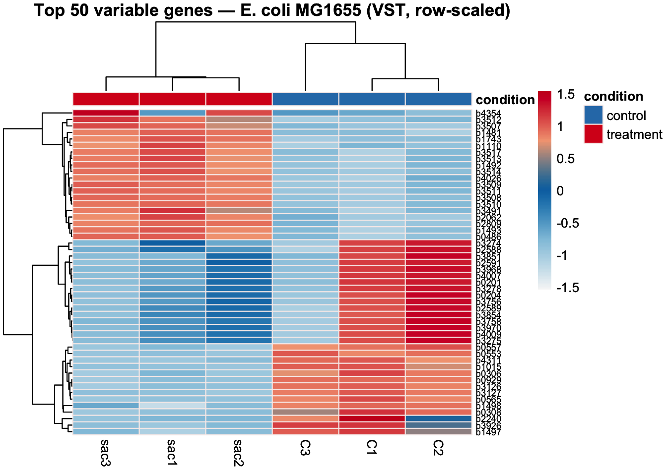
#install.packages("heatmaply")
png(
  filename = file.path(git_root, "results", "plots", "heatmap_top50_variable.png"),
  width    = 8,
  height   = 12,
  units    = "in",
  res      = 300
)
heat_plot
dev.off()
## quartz_off_screen
## 2library(heatmaply)
heatmaply(
assay(vsd)[topVarGenes, ],
scale = "row",
dist_method = "euclidean",
hclust_method = "complete",
col_side_colors = df_anno,
colors = colorRampPalette(colsHeat)(255),
show_dendrogram = c(TRUE, TRUE),
showticklabels = c(TRUE, TRUE),
fontsize_row = 7,
main = "Top 50 variable genes — E. coli MG1655 (VST, row-scaled)"
)4.11.1 Add gene names
gtf_path <- file.path(git_root, "data/genome_files/gtf/GCF_000005845.2_ASM584v2_genomic_full.gtf")

# Extract locus_tag and gene name from GTF attributes
gtf_map <- read.table(gtf_path, sep = "\t", quote = "", comment.char = "#") %>%
  filter(V3 == "gene") %>%
  mutate(
    locus_tag  = str_extract(V9, 'locus_tag "([^"]+)"', group = 1),
    gene_name  = str_extract(V9, '(?<=gene ")([^"]+)',  group = 1)
  ) %>%
  filter(!is.na(locus_tag)) %>%
  mutate(label = ifelse(!is.na(gene_name), gene_name, locus_tag)) %>%
  select(locus_tag, label) %>%
  distinct()

cat("Mapping built:", nrow(gtf_map), "genes\n")
## Mapping built: 4651 genestopVarGenes <- head(order(rowVars(assay(vsd)), decreasing = TRUE), 50)
# Swap locus tags to gene names for display
heat_mat <- assay(vsd)[topVarGenes, ]
row_labels <- gtf_map$label[match(rownames(heat_mat), gtf_map$locus_tag)]
rownames(heat_mat) <- ifelse(is.na(row_labels), rownames(heat_mat), row_labels)
df_anno <- as.data.frame(colData(vsd)[, "condition", drop = FALSE])
anno_colors <- list(condition = cols_condition)
colsHeat <- c("#F7F7F7", "#92C5DE", "#0571B0", "#F4A582", "#CA0020")
heat_plot <- pheatmap(
heat_mat,
cluster_cols = TRUE,
cluster_rows = TRUE,
scale = "row",
clustering_distance_rows = "euclidean",
clustering_distance_cols = "euclidean",
annotation_col = df_anno,
annotation_colors = anno_colors,
show_colnames = TRUE,
show_rownames = TRUE,
color = colorRampPalette(colsHeat)(255),
border_color = "#f8edeb",
fontsize_row = 7,
main = "Top 50 variable genes — E. coli MG1655 (VST, row-scaled)"
)
heat_plot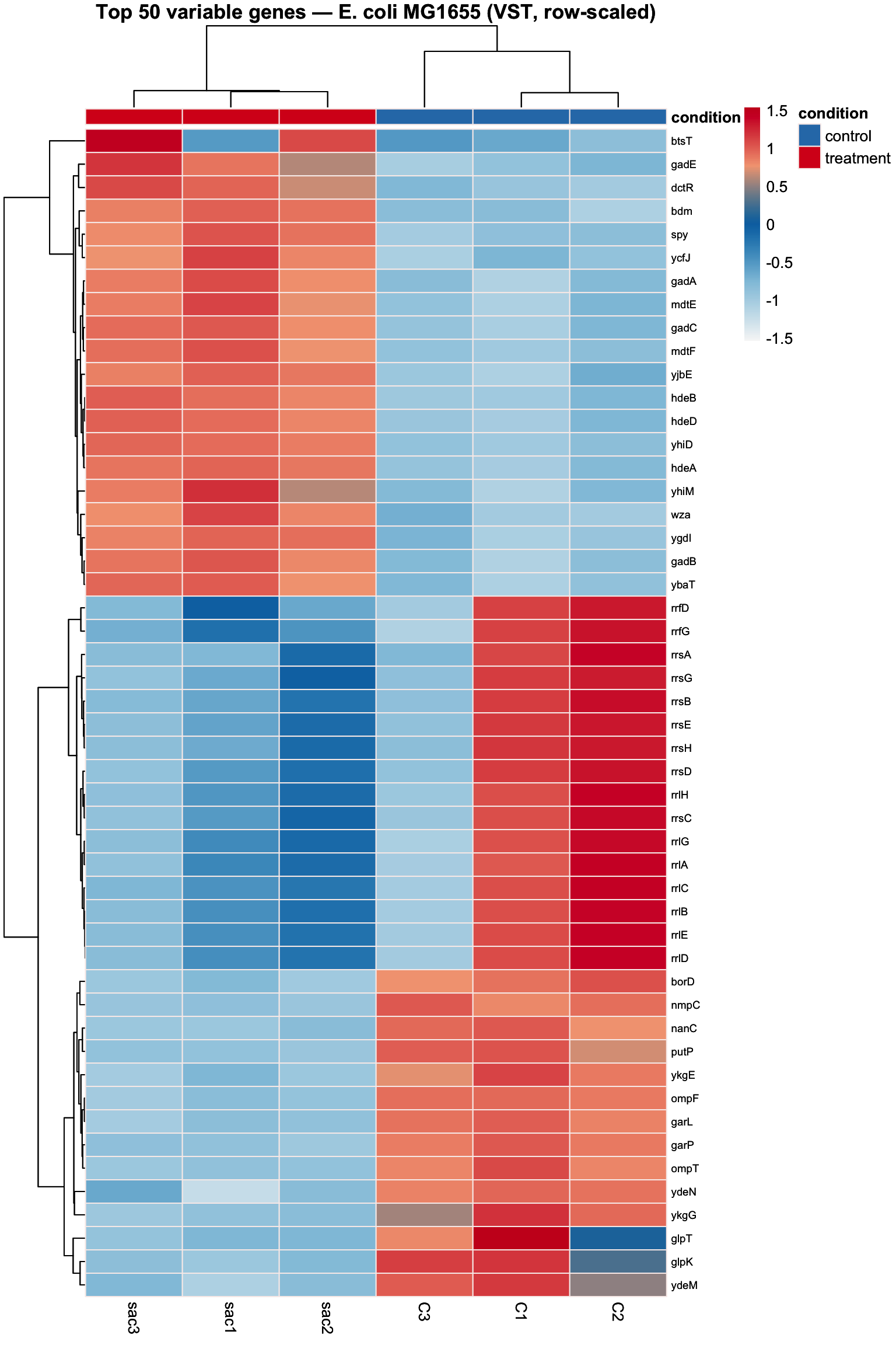
png(
  filename = file.path(git_root, "results", "plots", "heatmap_top50_DE_genes.png"),
  width    = 8,
  height   = 12,
  units    = "in",
  res      = 300
)
heat_plot
dev.off()
## quartz_off_screen
## 2How to read this heatmap:
- Each row is a gene, each column is a sample
- Colours show the z-score (row-scaled expression) — red = higher than average for that gene, blue = lower
- The dendrograms show hierarchical clustering — samples/genes that behave similarly are grouped together
What to look for:
- Clear colour blocks by condition → the treatment has a strong, consistent transcriptional effect
- Consistent colours within replicates → biological replicates are reproducible
- Genes in the upper cluster are upregulated in treatment (red in sac, blue in control)
- Genes in the lower cluster are downregulated in treatment (blue in sac, red in control)
- Note that C3 sits slightly apart from C1/C2 in the dendrogram — consistent with what we observed in the PCA and sample distance heatmap