2.12 Combining
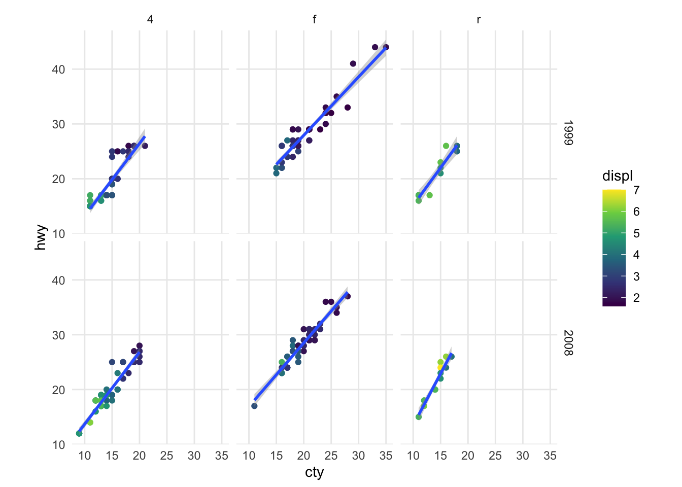
As mentioned at the start, you can layer all of the pieces to build a customized plot of your data, like the one shown at the beginning of this vignette:
ggplot(mpg, aes(cty, hwy)) +
  geom_point(mapping = aes(colour = displ)) +
  geom_smooth(formula = y ~ x, method = "lm") +
  scale_colour_viridis_c() +
  facet_grid(year ~ drv) +
  coord_fixed() +
  theme_minimal() +
  theme(panel.grid.minor = element_blank())