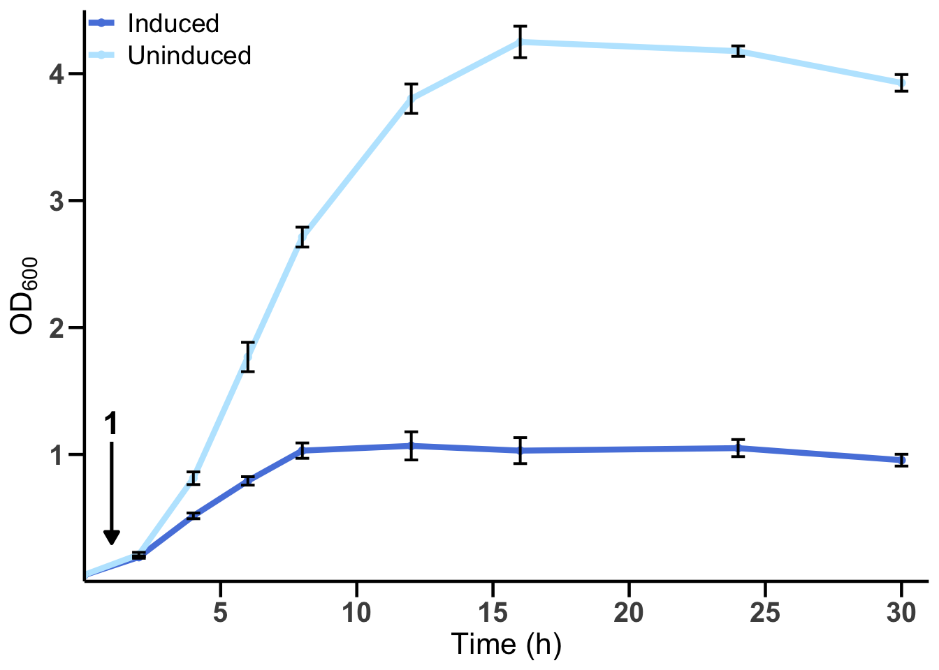
6.1 Solution for Figure 2a
First, read in the data and pivot it to a long format to make it tidy.
fig2a_data
fig2a_long <- fig2a_data %>%
  pivot_longer(
    cols = -`time (h)`,
    names_to = c("replicate", "condition"),
    names_sep = "_",
    values_to = "values"
  ) %>%
  mutate(condition = str_to_title(condition)) %>%
  # By transforming condition into a factor, we can control the order of the variables in the plot.
  mutate(condition = factor(condition, levels = c("Induced", "Uninduced")))
Next, summarize the data to get the mean and standard deviation for each time point and condition.
fig2a_summary <- fig2a_long %>%
  group_by(`time (h)`, condition) %>%
  summarize(
    mean = mean(values),
    sd = sd(values),
    .groups = 'drop'
  )
Now we can create the plot using ggplot2.
# Define colors for the conditions.
colors = c("Uninduced" = "#bce7fe", "Induced" = "#5884de")

p_fig2a <- ggplot(fig2a_summary, aes(x = `time (h)`, y = mean, color = condition)) +
  geom_line(linewidth = 1.5) +
  geom_point() +
  geom_errorbar(aes(ymin = mean - sd, ymax = mean + sd),
                color = "black", width = 0.5, linewidth = 0.7) +
  # Arrow pointing down at x = 1
  annotate("segment", x = 1, xend = 1, y = 1.1, yend = 0.3,
    arrow = grid::arrow(length = unit(0.25, "cm"), type = "closed"),
    color = "black", linewidth = 0.9
  ) +
  # Number "1" above the arrow
  annotate("text", x = 1, y = 1.25, label = "1", size = 6, fontface = "bold") +
  scale_color_manual(values = colors) +
  # Change x and y axis titles and limits
  labs(x = "Time (h)", y = expression(OD[600])) +
  scale_y_continuous(breaks = c(1, 2, 3, 4), expand = c(0, 0), limits = c(0, 4.5)) +
  scale_x_continuous(breaks = seq(5, 30, by = 5), expand = c(0, 0), limits = c(0, 31)) +
  # Apply a basic theme and customize it
  theme_minimal() +
  theme(
    panel.grid = element_blank(),
    axis.line = element_line(color = "black", linewidth = 0.8),
    axis.ticks = element_line(color = "black", linewidth = 0.8),
    axis.ticks.length = unit(0.3, "cm"),
    axis.text = element_text(size = 15, face = "bold"),
    axis.title = element_text(size = 16),
    legend.title = element_blank(),
    legend.text = element_text(size = 14),
    legend.position = c(0.1, 0.95)
  )
Finally, display the plot.