4.3 Compute and plot PCA (Principal Component Analysis)
Reshape the data for PCA.
pca_data <- protein_data_parsed_mut %>%
    select(Identifier, Reference, Intensity) %>%
    pivot_wider(names_from = Identifier, values_from = Intensity) %>%
    column_to_rownames(var = "Reference") %>%
    select(where(~ !any(is.na(.)))) %>% # remove columns with NA values.
    select(where(~ var(.) > 0)) # remove columns with zero variance.
Perform the PCA.
Get the percentage of variance explained by each principal component.
Create a data frame for plotting.
pca_df <- as.data.frame(pca_result$x) %>%
rownames_to_column(var = "Reference") %>%
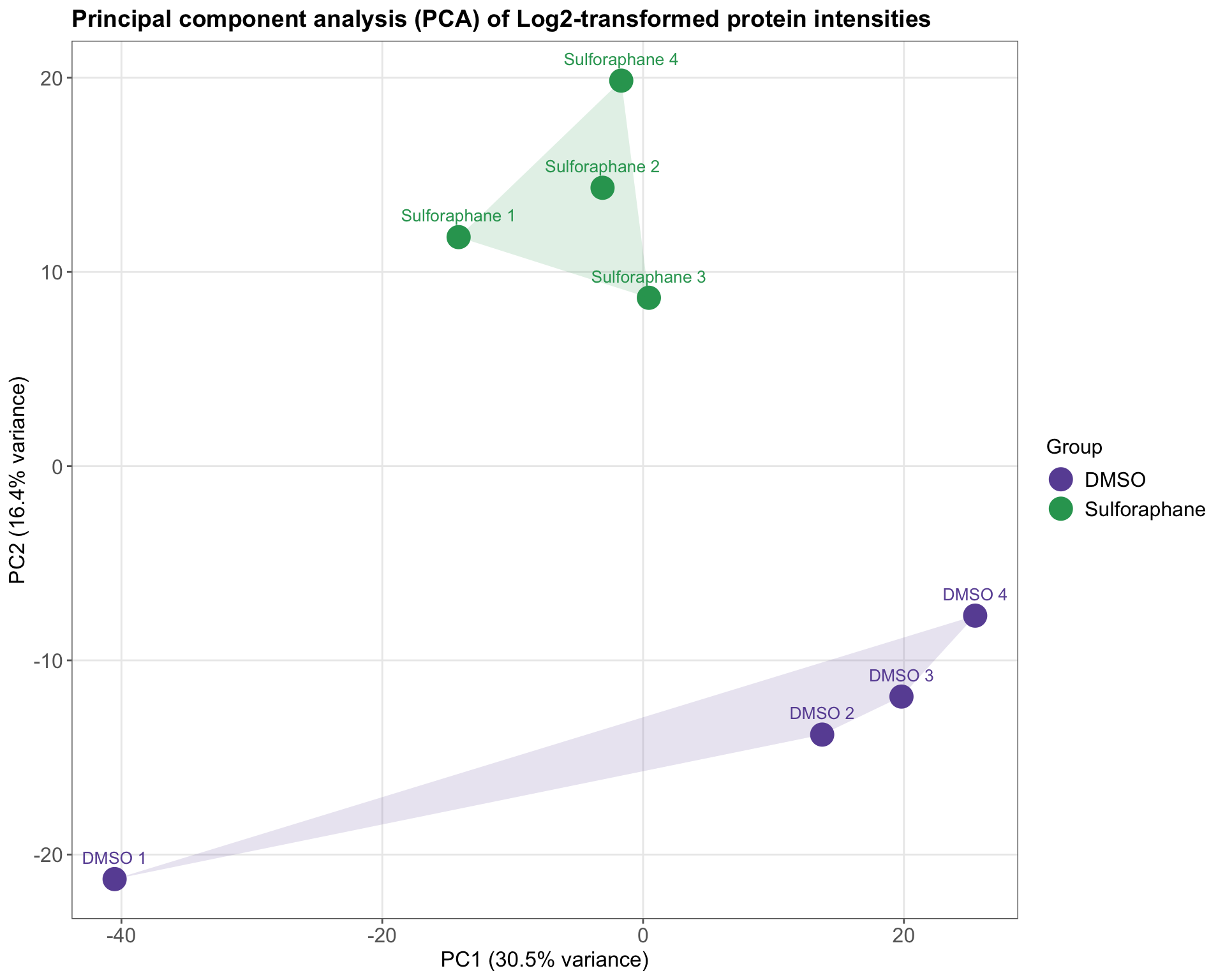
mutate(Label = if_else(str_detect(Reference, "DMSO"), "DMSO", "Sulforaphane"))Take a look at the PCA data frame that will be used for plotting.
##        Reference         PC1        PC2        PC3         PC4
## 1         DMSO 1 -40.5236994 -21.263605  -9.643622   2.0643358
## 2         DMSO 2  13.7332455 -13.822736  13.220601   0.9806235
## 3         DMSO 3  19.8122465 -11.864672   5.863109  -0.0572881
## 4         DMSO 4  25.4636747  -7.697248 -16.619225  -7.6995175
## 5 Sulforaphane 1 -14.1460645  11.793599  19.907967 -21.5451863
## 6 Sulforaphane 2  -3.1087881  14.334322   6.820141  17.9491878
## 7 Sulforaphane 3   0.4434575   8.669353   2.249586  15.2578529
## 8 Sulforaphane 4  -1.6740722  19.850987 -21.798556  -6.9500080
##           PC5        PC6          PC7          PC8        Label
## 1  -0.9507316   1.258466  -1.05864899 2.506960e-13         DMSO
## 2  14.0553245 -18.934979  -0.02030233 2.459518e-13         DMSO
## 3   8.2225187  22.743865   2.39521208 2.462277e-13         DMSO
## 4 -18.5430187  -4.678309  -5.77878509 2.423448e-13         DMSO
## 5  -7.3112721   1.097554   0.33856664 2.473822e-13 Sulforaphane
## 6  -2.2533926   1.808497 -18.20934008 2.490623e-13 Sulforaphane
## 7 -10.0897930  -2.272283  20.13713178 2.485977e-13 Sulforaphane
## 8  16.8703647  -1.022810   2.19616600 2.491229e-13 Sulforaphane
Plotting pipeline:
Calculate convex hulls for each group (optional). These are used to draw fancy polygons around the groups in the PCA plot.
Start ggplot, map global aesthetics (x and y axes, color, and labels)
Add points layer
Add polygon layer for convex hulls around the groups
Add text (point labels) layer
Add labels and titles for axes and legend
Customize colors for points and polygons
Apply minimal theme and further customize it
# Calculate convex  hulls for each group (optional)
hulls <- pca_df %>%
    group_by(Label) %>%
    slice(chull(PC1, PC2)) %>%
ungroup()ggplot(pca_df, aes(x = PC1, y = PC2, color = Label, label = Reference)) +
geom_point(size = 6) +
# Draw convex hulls around the groups
geom_polygon(
data = hulls, aes(x = PC1, y = PC2, fill = Label, color = Label),
alpha = 0.15, color = NA, show.legend = FALSE
) +
geom_text(vjust = -1.3, hjust = 0.5, size = 3.5, show.legend = FALSE) +
labs(
title = "Principal component analysis (PCA) of Log2-transformed protein intensities",
x = paste0("PC1 (", round(pca_variance[1], 1), "% variance)"),
y = paste0("PC2 (", round(pca_variance[2], 1), "% variance)"),
color = "Group"
) +
scale_color_manual(values = label_colors) +
scale_fill_manual(values = label_colors) +
theme_minimal() +
# Further customize the theme
theme(
axis.text = element_text(size = 12, color = "#666666"),
axis.title = element_text(size = 12.5),
plot.title = element_text(size = 14, face = "bold"),
legend.title = element_text(size = 12),
legend.text = element_text(size = 12),
legend.position = "right",
panel.grid.minor = element_blank(),
panel.border = element_rect(color = "#666666", fill = NA),
axis.ticks = element_line(color = "#666666")
)