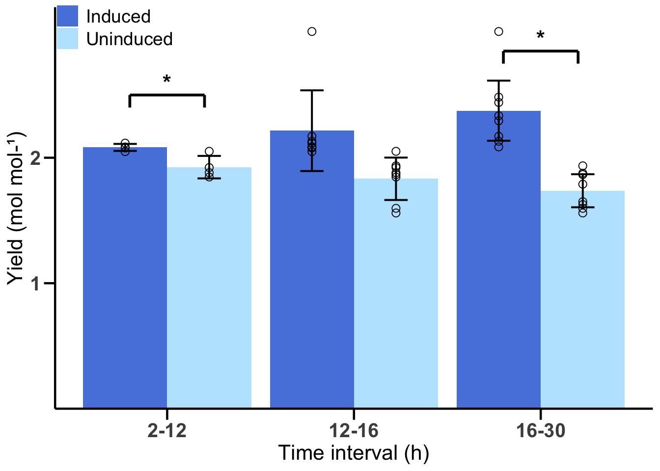
6.2 Solution for Figure 2b
First, read in the data and pivot it to a long format to make it tidy.
fig2b_data
fig2b_long <- fig2b_data %>%
  pivot_longer(
    cols = -`timepoint (h)`,
    names_to = c("condition", "replicate"),
    names_sep = "_",
    values_to = "values"
  ) %>%
  mutate(condition = str_to_title(condition)) %>%
  # By transforming condition into a factor, we can control the order of the variables in the plot.
  mutate(condition = factor(condition, levels = c("Induced", "Uninduced"))) %>%
      mutate("time_interval" = case_when(
    `timepoint (h)` >= 2 & `timepoint (h)` < 12 ~ "2-12",
    `timepoint (h)` >= 12 & `timepoint (h)` < 16 ~ "12-16",
    `timepoint (h)` >= 16 & `timepoint (h)` <= 30 ~ "16-30"
  )) %>%
  mutate(time_interval = factor(time_interval, levels = c("2-12", "12-16", "16-30")))
Next, summarize the data to get the mean and standard deviation for each time interval and condition.
fig2b_summary <- fig2b_long %>%
  group_by(condition, time_interval) %>%
  summarize(
    mean = mean(values),
    sd = sd(values),
    .groups = 'drop')
Now we can create the plot using ggplot2.
p_fig2b <- ggplot(fig2b_summary, aes(x = time_interval, y = mean, fill = condition)) +
  geom_bar(position = "dodge", stat = "identity") +
  geom_errorbar(aes(ymin = mean - sd, ymax = mean + sd),
                position = position_dodge(0.9), width = 0.25, linewidth = 0.7) +
  geom_point(
    data = fig2b_long %>% distinct(condition, time_interval, replicate, values),
    aes(x = time_interval, y = values, group = condition),
    color = "black", shape = 1,
    position = position_dodge(width = 0.9),
    size = 2.5,
    show.legend = FALSE
  ) +
  # Include brackets and asterisks for significance. Sometimes it's easier to do this in a graphic editor.
  annotate("segment", x = 0.8, xend = 1.2, y = 2.5, yend = 2.5, linewidth = 1) +
  annotate("segment", x = 0.8, xend = 0.8, y = 2.5, yend = 2.4, linewidth = 1) +
  annotate("segment", x = 1.2, xend = 1.2, y = 2.5, yend = 2.4, linewidth = 1) +
  annotate("text", x = 1, y = 2.6, label = "*", size = 6, fontface = "bold") +
  annotate("segment", x = 2.8, xend = 3.2, y = 2.85, yend = 2.85, linewidth = 1) +
  annotate("segment", x = 2.8, xend = 2.8, y = 2.85, yend = 2.75, linewidth = 1) +
  annotate("segment", x = 3.2, xend = 3.2, y = 2.85, yend = 2.75, linewidth = 1) +
  annotate("text", x = 3, y = 2.95, label = "*", size = 6, fontface = "bold") +
  # Use the same colors as in Fig 2a and adjust axes.
  scale_fill_manual(values = colors) +
  scale_y_continuous(breaks = c(1, 2), expand = c(0, 0), limits = c(0, 3.2)) +
  labs(
    x = "Time interval (h)",
    y = "Yield (mol mol-¹)"
  ) +
  # Set a basic theme and customize it
  theme_minimal() +
  theme(
    panel.grid = element_blank(),
    axis.line = element_line(color = "black", linewidth = 0.8),
    axis.ticks = element_line(color = "black", linewidth = 0.8),
    axis.ticks.length = unit(0.3, "cm"),
    axis.text = element_text(size = 15, face = "bold"),
    axis.title = element_text(size = 16),
    legend.title = element_blank(),
    legend.text = element_text(size = 14),
    legend.position = c(0.1, 0.95)
  )
Finally, display the plot.