4.4 Identify and plot proteins with highest fold-change between conditions
Compute fold changes (Log2FC) between Sulforaphane and DMSO for each protein.
fold_changes <- protein_data_parsed %>%
    group_by(Gene, Label) %>%
    filter(n() >= 2) %>% # keep only labels with >=2 replicates
    ungroup() %>%
    group_by(Gene) %>%
    filter(n_distinct(Label) == 2) %>% # keep only proteins present in both groups
    summarize(
        DMSO = mean(Intensity[Label == "DMSO"], na.rm = TRUE),
        Sulforaphane = mean(Intensity[Label == "Sulforaphane"], na.rm = TRUE),
        .groups = "drop"
    ) %>%
    mutate(
        Log2FC = Sulforaphane - DMSO, # already log2-transformed
    ) %>%
    # Prepare a column indicating in which condition intensity is higher
    # This column will be used for faceting the plot later
    mutate(higher_in = case_when(
        Log2FC > 0 ~ "Higher in Sulforaphane",
        Log2FC < 0 ~ "Higher in DMSO",
        TRUE ~ "No change"
    )) %>%
    arrange(desc(Log2FC))
Extract top 20 proteins with highest absolute Log2FC in each condition.
top_proteins_DMSO <- fold_changes %>%
    filter(higher_in == "Higher in DMSO") %>%
    slice_max(order_by = abs(Log2FC), n = 20)
top_proteins_sulforaphane <- fold_changes %>%
filter(higher_in == "Higher in Sulforaphane") %>%
slice_max(order_by = abs(Log2FC), n = 20)Combine the top proteins from both conditions into a single data frame.
Prepare data for plotting.
plot_data_fc <- protein_data_parsed %>%
    group_by(Gene, Label) %>%
    summarize(
        Mean = mean(Intensity, na.rm = TRUE),
        SD = sd(Intensity, na.rm = TRUE),
        .groups = "drop"
    ) %>%
    # Inner join the current data frame with the top proteins to keep only those
    inner_join(top_proteins_both[, c("Gene", "higher_in")], by = "Gene")
Take a look at the data to be plotted.
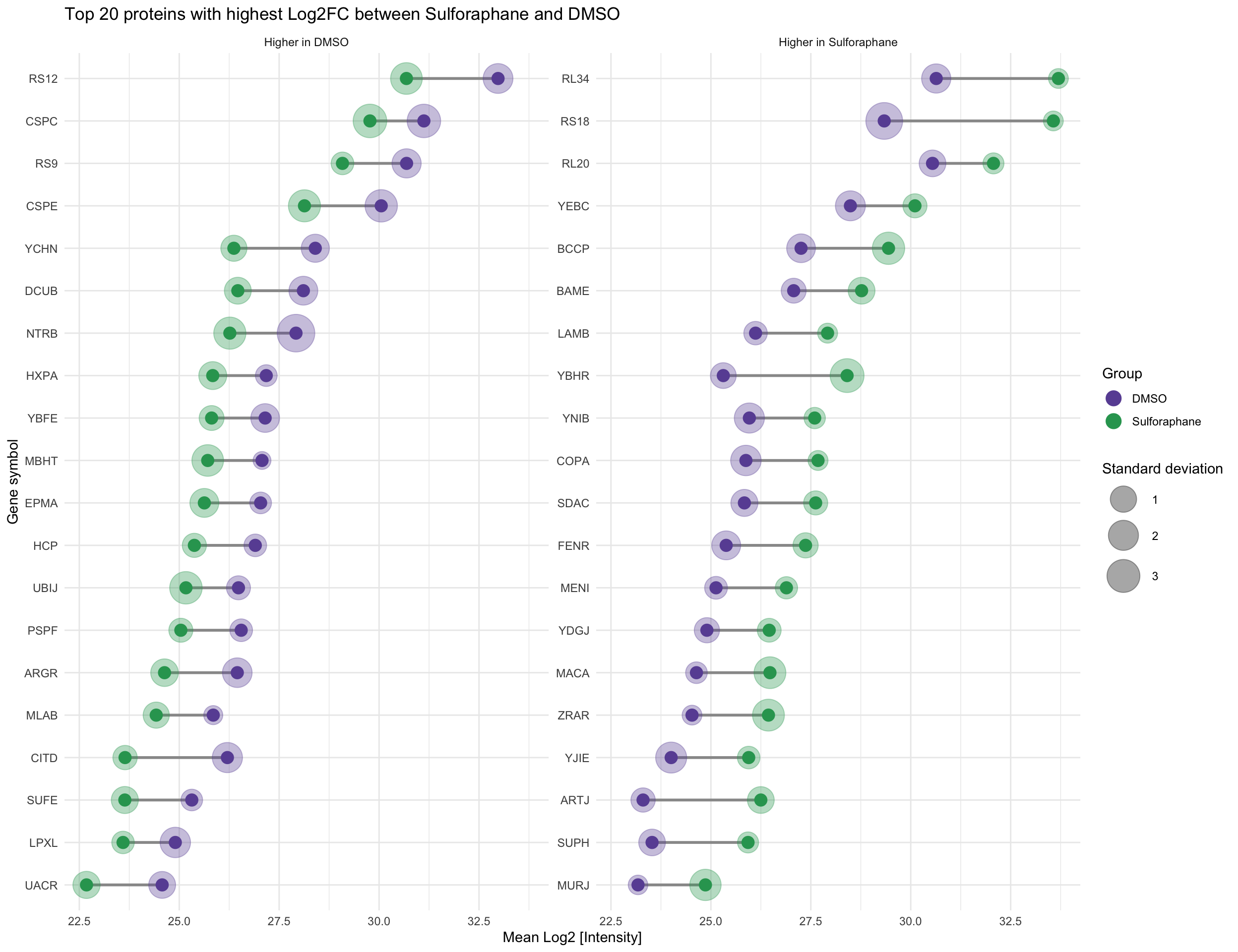
## # A tibble: 10 × 5
##    Gene  Label         Mean    SD higher_in
##    <chr> <chr>        <dbl> <dbl> <chr>
##  1 ARGR  DMSO          26.5 1.86  Higher in DMSO
##  2 ARGR  Sulforaphane  24.6 1.30  Higher in DMSO
##  3 ARTJ  DMSO          23.3 0.618 Higher in Sulforaphane
##  4 ARTJ  Sulforaphane  26.2 1.10  Higher in Sulforaphane
##  5 BAME  DMSO          27.1 0.728 Higher in Sulforaphane
##  6 BAME  Sulforaphane  28.8 1.11  Higher in Sulforaphane
##  7 BCCP  DMSO          27.3 1.60  Higher in Sulforaphane
##  8 BCCP  Sulforaphane  29.4 2.76  Higher in Sulforaphane
##  9 CITD  DMSO          26.2 2.03  Higher in DMSO
## 10 CITD  Sulforaphane  23.6 0.628 Higher in DMSO
Plotting pipeline:
Start ggplot, map global aesthetics (x and y axes, color, and group)
Reorder genes based on their mean intensity for better visualization
Add lines connecting the points of the same gene (needs ‘group’ aesthetic for the correct behavior)
Add “shadow” points representing the standard deviation. They should be behind the main points, so add them first.
Add points for each condition.
Refine size scale for the SD points for better visibility
Flip coordinates. What is mapped to x axis goes to y axis and vice versa.
ggplot(plot_data_fc, aes(x = reorder(Gene, Mean), y = Mean, color = Label, group = Gene)) +
    geom_line(color = "#999999", linewidth = 1, show.legend = FALSE) +
    geom_point(aes(size = SD),
        position = position_dodge(width = 0.5), alpha = 0.35,
        show.legend = TRUE
    ) +
    geom_point(position = position_dodge(width = 0.5), size = 4, show.legend = FALSE) +
    scale_size_continuous(range = c(6, 13), breaks = c(1, 2, 3)) +
    coord_flip() +
    labs(
        title = "Top 20 proteins with highest Log2FC between Sulforaphane and DMSO",
        x = "Gene symbol",
        y = "Mean Log2 [Intensity]",
        size = "Standard deviation",
        color = "Group"
    ) +
    scale_color_manual(values = label_colors) +
    theme_minimal() +
    facet_wrap(~higher_in, scales = "free_y", nrow = 1) +
    guides(color = guide_legend(
        override.aes = list(size = 5, alpha = 1)
    ))
❓ Question: How does the plot look like if you remove geom_ layers one by one?