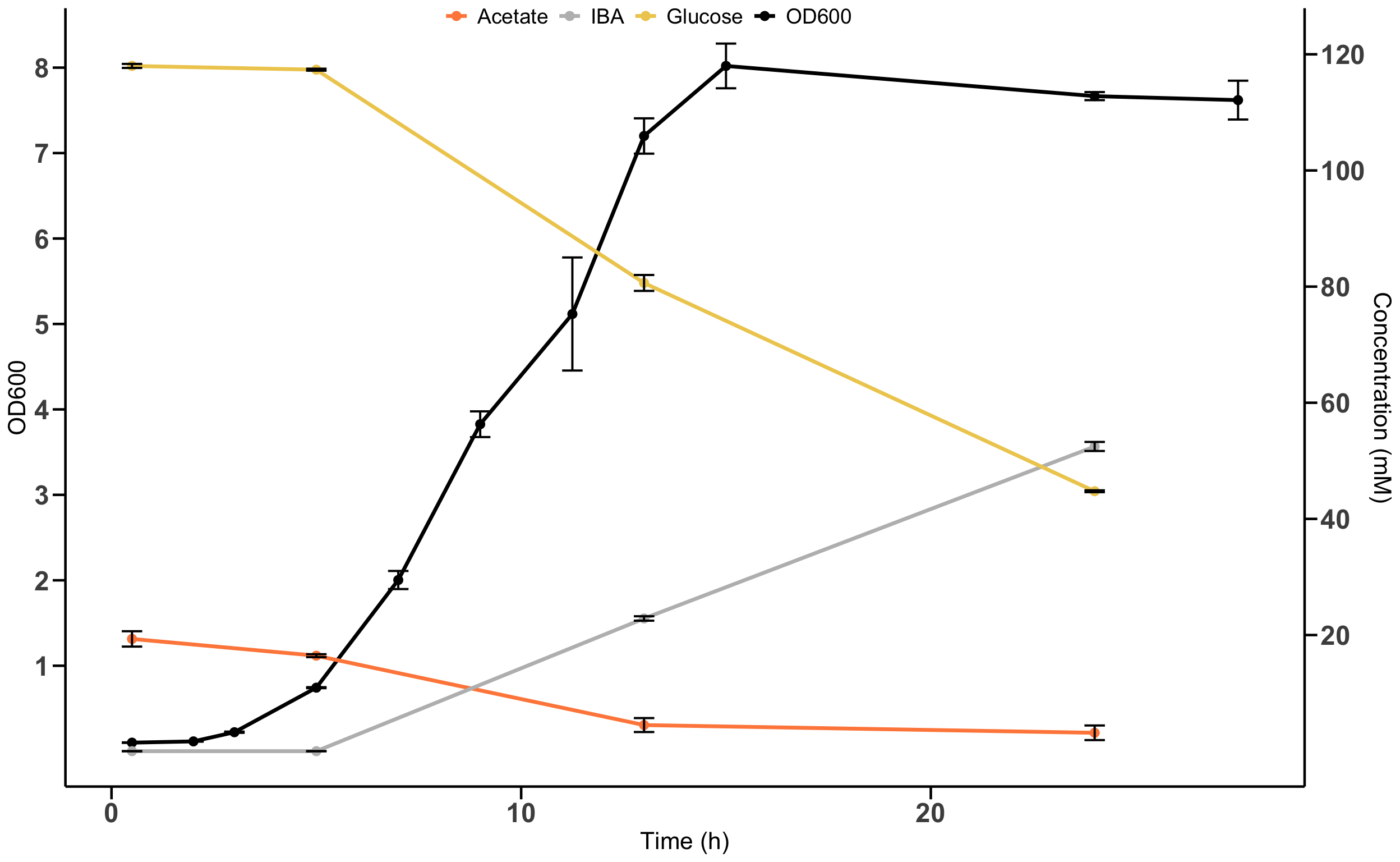
6.4 Solution for Figure 2d
This table is also a bit messy. We need to do some cleaning first.
fig2d_data
## New names:
## • `IBA strain - OD600` -> `IBA strain - OD600...2`
## • `IBA strain - OD600` -> `IBA strain - OD600...3`
## • `IBA strain - OD600` -> `IBA strain - OD600...4`
## • `Glucose (mM)` -> `Glucose (mM)...5`
## • `Glucose (mM)` -> `Glucose (mM)...6`
## • `Glucose (mM)` -> `Glucose (mM)...7`
## • `Acetate (mM)` -> `Acetate (mM)...8`
## • `Acetate (mM)` -> `Acetate (mM)...9`
## • `Acetate (mM)` -> `Acetate (mM)...10`
## • `IBA (mM)` -> `IBA (mM)...11`
## • `IBA (mM)` -> `IBA (mM)...12`
## • `IBA (mM)` -> `IBA (mM)...13`
fig2d_data_clean <- fig2d_data %>%
# rename the problematic column names added by R (with "..." suffixes)
rename(
od600_1 = `IBA strain - OD600...2`,
od600_2 = `IBA strain - OD600...3`,
od600_3 = `IBA strain - OD600...4`,
glucose_1 = `Glucose (mM)...5`,
glucose_2 = `Glucose (mM)...6`,
glucose_3 = `Glucose (mM)...7`,
acetate_1 = `Acetate (mM)...8`,
acetate_2 = `Acetate (mM)...9`,
acetate_3 = `Acetate (mM)...10`,
ibamM_1 = `IBA (mM)...11`,
ibamM_2 = `IBA (mM)...12`,
ibamM_3 = `IBA (mM)...13`,
time_h = condition,
) %>%
# remove header/extra rows if present and ensure numeric columns
slice(-1) %>%
# fix column types transforming them from character to numeric
mutate(across(where(is.character), as.numeric)) %>%
# convert to long format, separate measure and replicate and remove NAs
pivot_longer(
cols = -time_h,
names_to = c("measure_replicate"),
values_to = "values"
) %>%
separate(measure_replicate, into = c("measure", "replicate"), sep = "_") %>%
filter(!is.na(values))
Next, summarize the data to get the mean and standard deviation for each time point and measure.
fig2d_summary <- fig2d_data_clean %>%
  group_by(time_h, measure) %>%
  summarize(
    mean = mean(values),
    sd = sd(values),
    .groups = 'drop'
  )
We have to separate the data for OD600 and concentrations to plot them with different y-axes.
df_od <- fig2d_summary %>%
  filter(measure == "od600") %>%
  mutate(measure = "OD600")

df_conc <- fig2d_summary %>%
  filter(measure %in% c("glucose", "acetate", "ibamM")) %>%
  mutate(measure = case_when(
    measure == "glucose" ~ "Glucose",
    measure == "acetate" ~ "Acetate",
    measure == "ibamM" ~ "IBA"
  )) %>%
  mutate(measure = factor(measure, levels = c("Acetate", "IBA", "Glucose")))
Since ggplot2 does not support dual y-axes directly, we need to scale one of the variables so that they fit well together.
ggplot2only supports a second y-axis that is a linear transformation of the first y-axis. Therefore, we need to find a function that maps the concentration values to the OD600 scale.
Now we can create the plot using ggplot2.
# Define colors for the variables.
variable_colors = c(
  "OD600" = "black",
  "Glucose" = "#eecc5d",
  "Acetate" = "#ff8949",
  "IBA" = "#bcbcbc"
)

# There is no global mapping inside ggplot() since we have two different datasets.
# We need to specify the aes() mappings inside each geom_...() function.
p_fig2d <- ggplot() +
  geom_line(data = df_od, aes(x = time_h, y = mean, color = "OD600"), linewidth = 1.2) +
  geom_point(data = df_od, aes(x = time_h, y = mean, color = "OD600"), size = 2.5) +
  geom_errorbar(data = df_od, aes(x = time_h, y = mean, ymin = mean - sd, ymax = mean + sd),
    color = "black", width = 0.5, linewidth = 0.7) +
  geom_line(data = df_conc, aes(x = time_h, y = mean / scale_factor, color = measure), linewidth = 1.2) +
  geom_point(data = df_conc, aes(x = time_h, y = mean / scale_factor, color = measure), size = 2.5) +
  geom_errorbar(data = df_conc, aes(x = time_h, y = mean / scale_factor, ymin = (mean - sd) / scale_factor, ymax = (mean + sd) / scale_factor),
    color = "black", width = 0.5, linewidth = 0.7) +
  labs(x = "Time (h)") +
  # sec.axis() defines the secondary y-axis and how to transform the primary y-axis values to the secondary axis values.
  # Here we can set limits and breaks for both y-axes.
  scale_y_continuous(name = "OD600", sec.axis = sec_axis(~ . * scale_factor, name = "Concentration (mM)",
    breaks = seq(20, 120, by = 20)),
        breaks = seq(1, 8, by = 1)) +
  scale_color_manual(values = variable_colors) +
  # Apply a basic theme and customize it
  theme_minimal() +
  theme(
    panel.grid = element_blank(),
    axis.line = element_line(color = "black", linewidth = 0.8),
    axis.ticks = element_line(color = "black", linewidth = 0.8),
    axis.ticks.length = unit(0.3, "cm"),
    axis.text = element_text(size = 18, face = "bold"),
    axis.title = element_text(size = 16),
    legend.title = element_blank(),
    legend.text = element_text(size = 14),
    legend.direction = "horizontal",
    legend.position = c(0.47, 0.99)
  )
Display the plot.
❓ Question: can you put the arrow from the original plot?