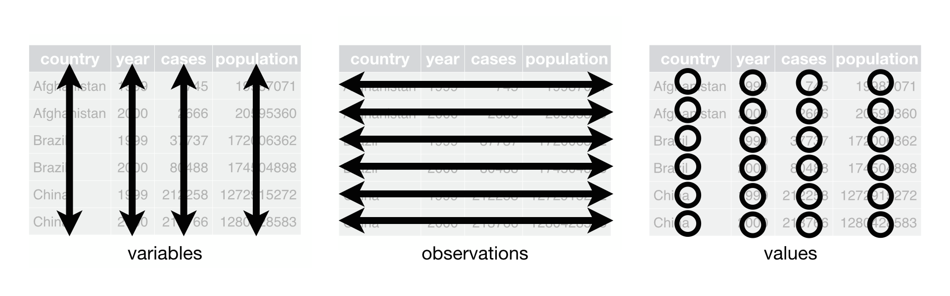
2.1 Data
As the foundation of every graphic, ggplot2 uses data to construct a plot. The system works best if the data is provided in a tidy format (we’re going to explorer it in the next section), which briefly means a rectangular data frame structure where rows are observations and columns are variables.
As the first step in many plots, you would pass the data to the ggplot() function, which stores the data to be used later by other parts of the plotting system. For example, if we intend to make a graphic about the mpg dataset, we would start as follows:
📌 Remember: Load the library before starting the analysis.
## # A tibble: 234 × 11
##    manufacturer model   displ  year   cyl trans drv     cty   hwy
##    <chr>        <chr>   <dbl> <int> <int> <chr> <chr> <int> <int>
##  1 audi         a4        1.8  1999     4 auto… f        18    29
##  2 audi         a4        1.8  1999     4 manu… f        21    29
##  3 audi         a4        2    2008     4 manu… f        20    31
##  4 audi         a4        2    2008     4 auto… f        21    30
##  5 audi         a4        2.8  1999     6 auto… f        16    26
##  6 audi         a4        2.8  1999     6 manu… f        18    26
##  7 audi         a4        3.1  2008     6 auto… f        18    27
##  8 audi         a4 qua…   1.8  1999     4 manu… 4        18    26
##  9 audi         a4 qua…   1.8  1999     4 auto… 4        16    25
## 10 audi         a4 qua…   2    2008     4 manu… 4        20    28
## # ℹ 224 more rows
## # ℹ 2 more variables: fl <chr>, class <chr>
💡 Tip: You can use the command View to visualize the data. Try it yourself.
🧠 Advanced: DT package is an excellent option to explore the metadata! Try it yourself.
Simple
Complex
mpg includes information about the fuel economy of popular car models in 1999 and 2008, collected by the US Environmental Protection Agency
The variables are mostly self-explanatory:
cty and hwy record miles per gallon (mpg) for city and highway driving.
displ is the engine displacement in litres.
drv is the drivetrain: front wheel (f), rear wheel (r) or four wheel (4).
model is the model of car. There are 38 models, selected because they had a new edition every year between 1999 and 2008.
class is a categorical variable describing the “type” of car: two seater, SUV, compact, etc.
📘 Note: You can list all the data available in ggplot with tthe following command:
This dataset suggests many interesting questions.
-How are engine size and fuel economy related?
-Do certain manufacturers care more about fuel economy than others?
-Has fuel economy improved in the last ten years?
We will try to answer some of these questions, and in the process learn how to create some basic plots with ggplot2.
📌 Remember: Data visualization is a way to tell the story of your data.

2.1.2 Mapping - Aesthetic
The mapping of a plot is a set of instructions on how parts of the data are mapped onto aesthetic attributes of geometric objects. It is the ‘dictionary’ to translate tidy data to the graphics system.
A mapping can be made by using the aes() function to make pairs of graphical attributes and parts of the data. If we want the cty and hwy columns to map to the x- and y-coordinates in the plot, we can do that as follows:
2.1.3 Layers
The heart of any graphic is the layers. They take the mapped data and display it in something humans can understand as a representation of the data. Every layer consists of three important parts:
The geometry that determines how data are displayed, such as points, lines, or rectangles.
The statistical transformation that may compute new variables from the data and affect what of the data is displayed.
The position adjustment that primarily determines where a piece of data is being displayed.
A layer can be constructed using the geom_() and stat_() functions. These functions often determine one of the three parts of a layer, while the other two can still be specified.
Here is how we can use two layers to display the cty and hwy columns of the mpg dataset as points and stack a trend line on top.
Here’s a simple example:
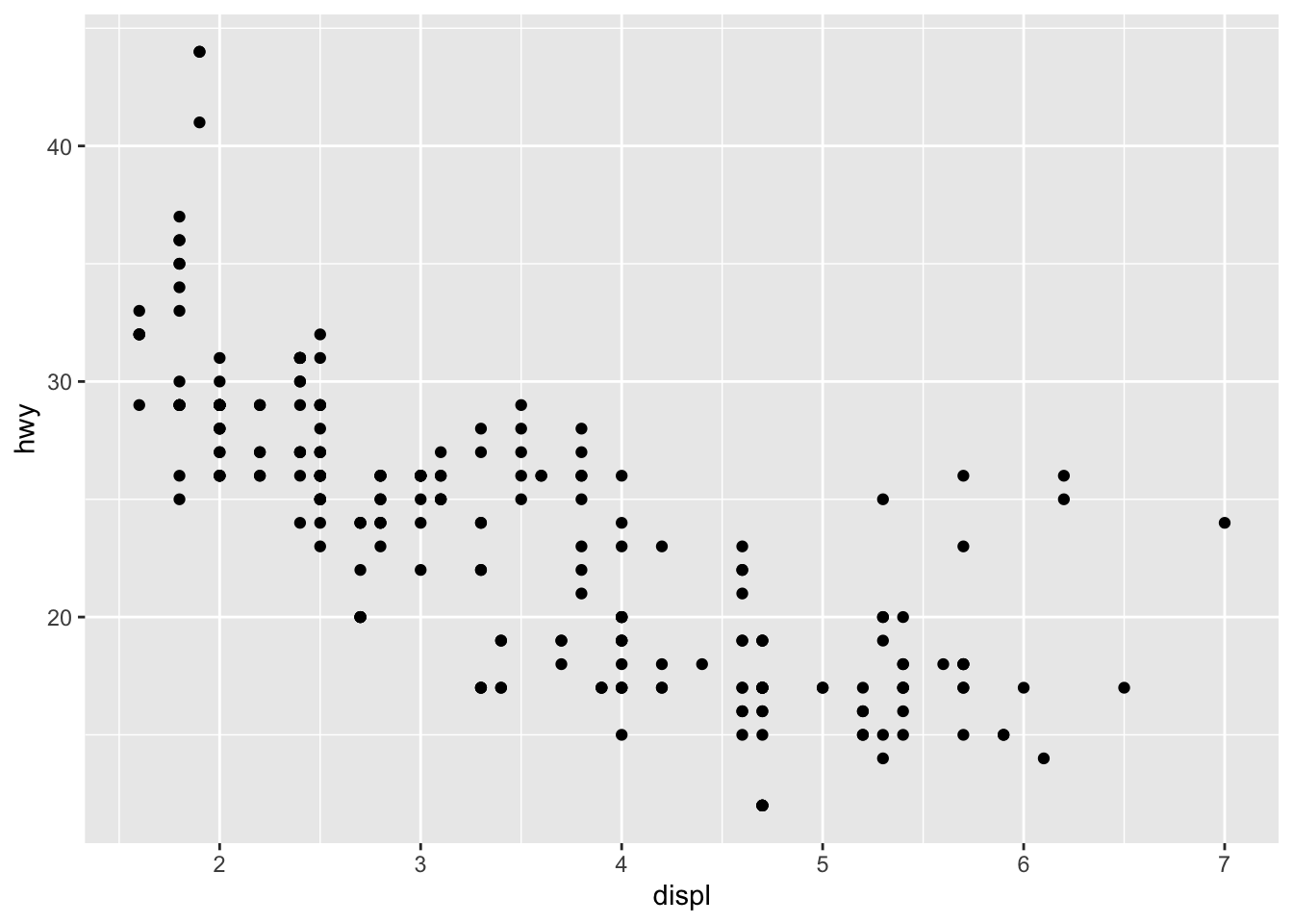
This produces a scatterplot defined by:
- Data:
mpg. - Aesthetic mapping: engine size mapped to x position, fuel economy to y position.
- Layer: points.
Pay attention to the structure of this function call: data and aesthetic mappings are supplied in ggplot(), then layers are added on with +.
⭐ Important: + is an important pattern to learn
This is an important pattern, and as you learn more about ggplot2 you’ll construct increasingly sophisticated plots by adding on more types of components.
Almost every plot maps a variable to x and y, so naming these aesthetics is tedious, so the first two unnamed arguments to aes() will be mapped to x and y.
This means that the following code is identical to the example above:

💡 Tip: Don’t forget that the first two arguments to aes() are x and y.
📘 Note: Note that we’ve put each command on a new line. We recommend doing this in your own code, so it’s easy to scan a plot specification and see exactly what’s there.
The plot shows a strong correlation: as the engine size gets bigger, the fuel economy gets worse.
There are also some interesting outliers: some cars with large engines get higher fuel economy than average.
❓ Question: What sort of cars do you think they are?