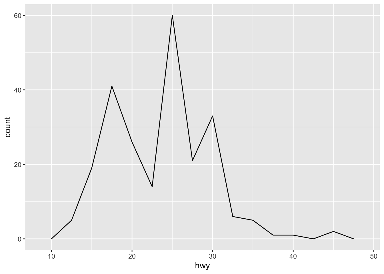
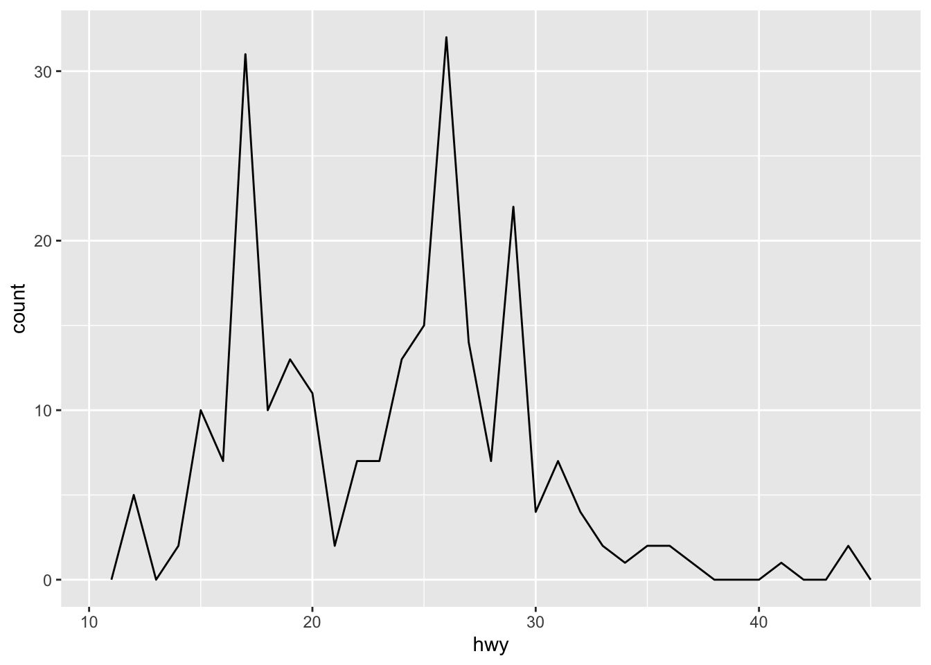
2.8 Histograms and frequency polygons
Histograms and frequency polygons show the distribution of a single numeric variable. They provide more information about the distribution of a single group than boxplots do, at the expense of needing more space.
## `stat_bin()` using `bins = 30`. Pick better value with
## `binwidth`.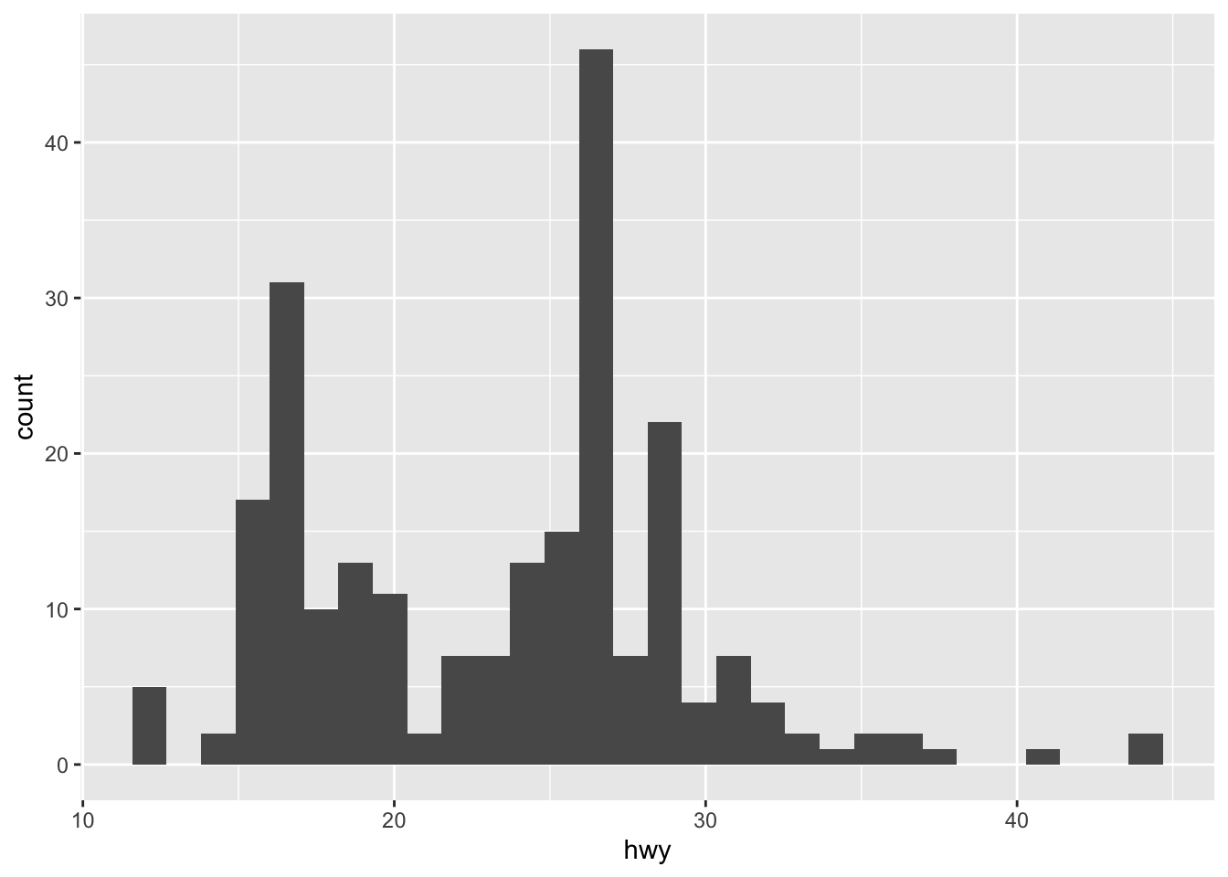
## `stat_bin()` using `bins = 30`. Pick better value with
## `binwidth`.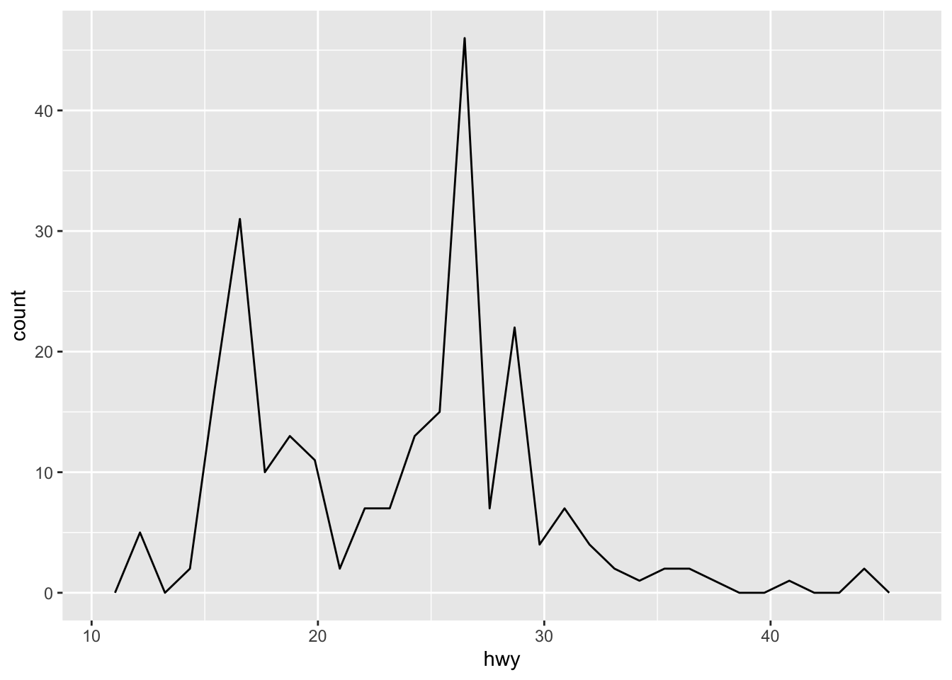
Both histograms and frequency polygons work in the same way: they bin the data, then count the number of observations in each bin.
The only difference is the display: histograms use bars and frequency polygons use lines.
You can control the width of the bins with the binwidth argument (if you don’t want evenly spaced bins you can use the breaks argument).
It is very important to experiment with the bin width.
The default just splits your data into 30 bins, which is unlikely to be the best choice.
You should always try many bin widths, and you may find you need multiple bin widths to tell the full story of your data.
An alternative to the frequency polygon is the density plot, geom_density().
A little care is required if you’re using density plots: compared to frequency polygons they are harder to interpret since the underlying computations are more complex.
They also make assumptions that are not true for all data, namely that the underlying distribution is continuous, unbounded, and smooth.
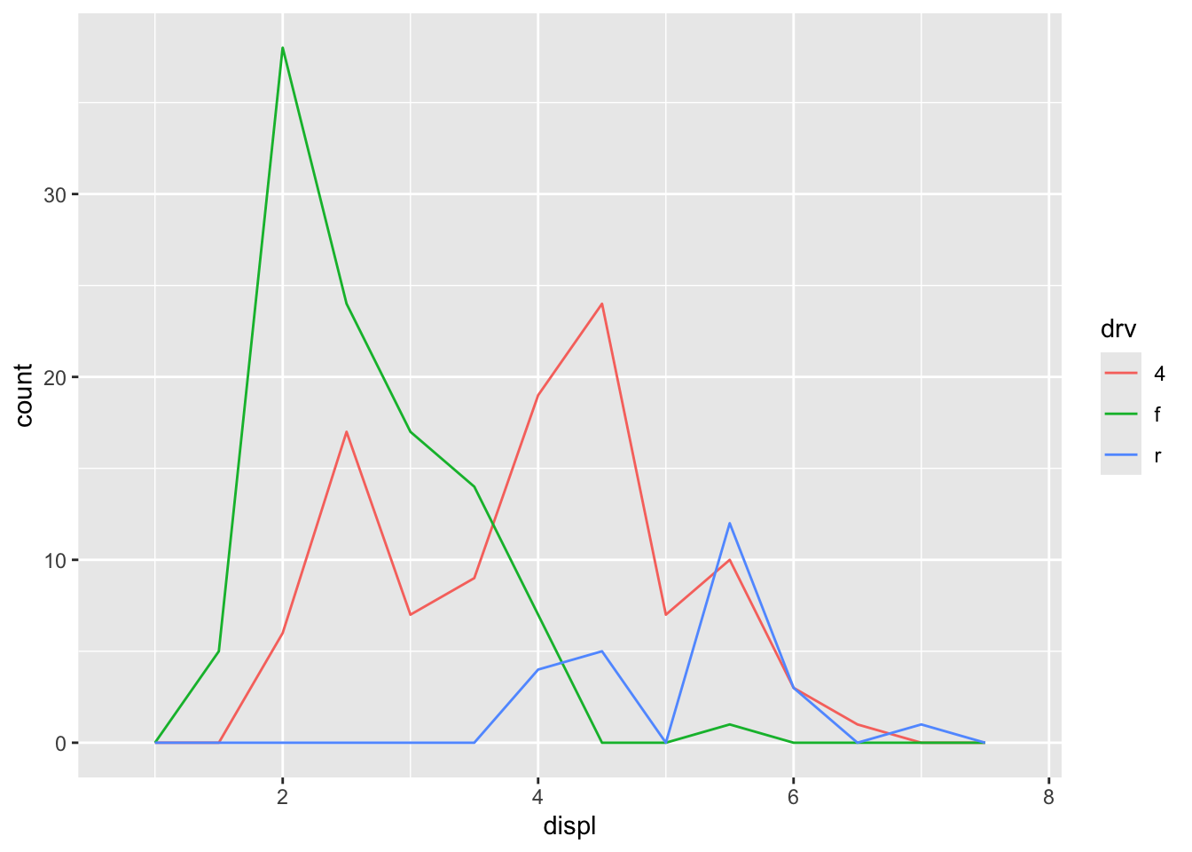
To compare the distributions of different subgroups, you can map a categorical variable to either fill (for geom_histogram()) or colour (for geom_freqpoly()).
It’s easier to compare distributions using the frequency polygon because the underlying perceptual task is easier.
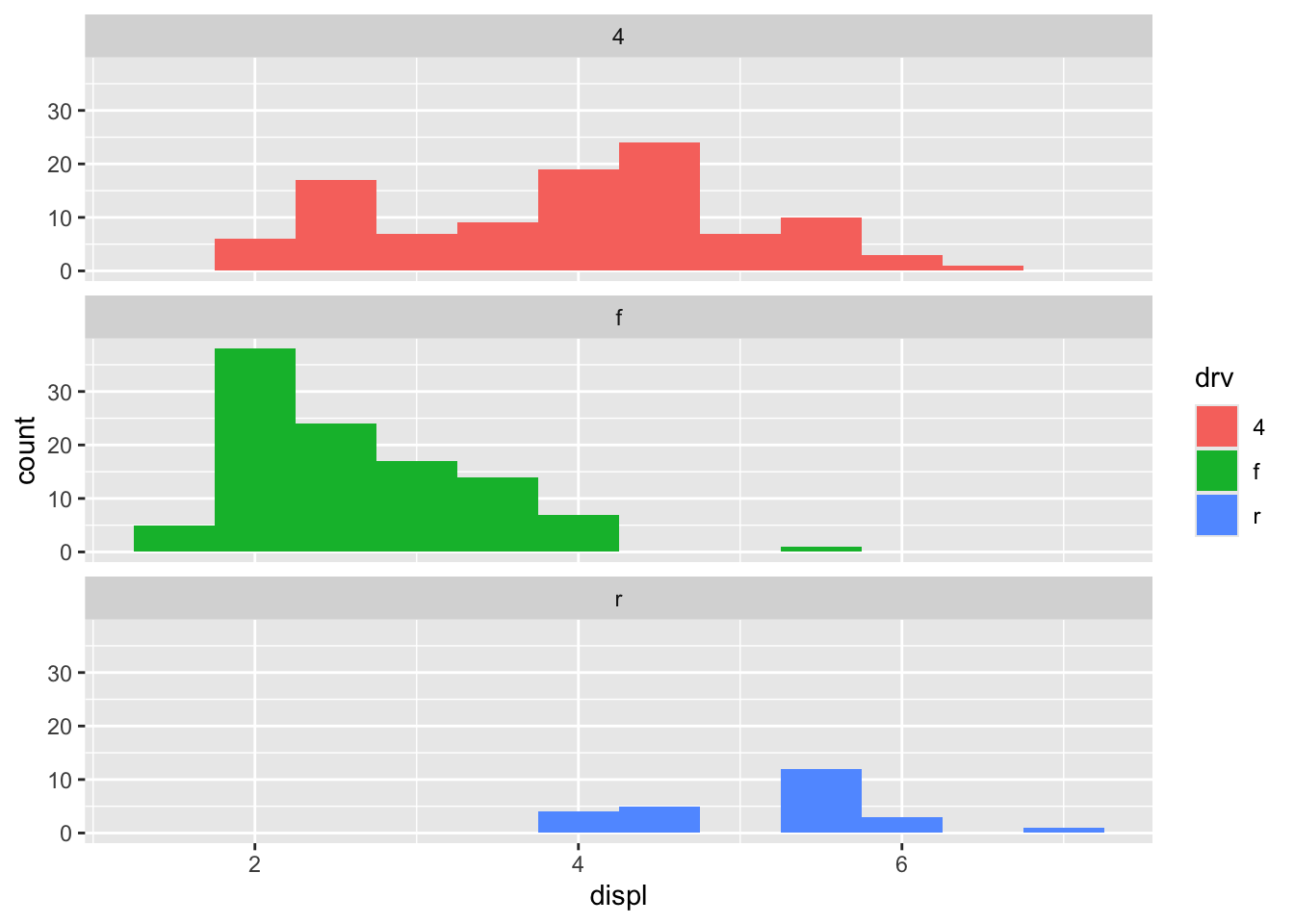
You can also use faceting: this makes comparisons a little harder, but it’s easier to see the distribution of each group.