6.3 Solution for Figure 2c
This table is more complex because it’s a bit messy for R. We need to do some cleaning first.
We put “|” in the column names to separate condition and measure later using separate() (od600 or sd).
fig2c_data
## New names:
## • `10 mM glucose` -> `10 mM glucose...2`
## • `10 mM glucose` -> `10 mM glucose...3`
## • `25 mM acetate` -> `25 mM acetate...4`
## • `25 mM acetate` -> `25 mM acetate...5`
## • `10 mM glucose + 25 mM acetate` -> `10 mM glucose + 25 mM
##   acetate...6`
## • `10 mM glucose + 25 mM acetate` -> `10 mM glucose + 25 mM
##   acetate...7`
fig2c_data_clean <- fig2c_data %>%
# rename the problematic column names added by R (with "..." suffixes)
rename(
"10_mM_glucose|od600" = "10 mM glucose...2",
"10_mM_glucose|sd" = "10 mM glucose...3",
"25_mM_acetate|od600" = "25 mM acetate...4",
"25_mM_acetate|sd" = "25 mM acetate...5",
"10_mM_glucose_25_mM_acetate|od600" = "10 mM glucose + 25 mM acetate...6",
"10_mM_glucose_25_mM_acetate|sd" = "10 mM glucose + 25 mM acetate...7"
) %>%
# remove header/extra rows if present, rename the time column and ensure it's numeric
slice(-1, -2) %>%
rename("time_h" = "condition") %>%
mutate(across(where(is.character), as.numeric)) %>%
# convert to long format
pivot_longer(
cols = -time_h,
names_to = c("condition_measure"),
values_to = "values"
) %>%
# separate condition and measure into different columns
separate(condition_measure, into = c("condition", "measure"), sep = "\\|") %>%
# convert back to wide format
pivot_wider(
names_from = measure,
values_from = values
) %>%
# clean up condition names
mutate(condition = case_when(
condition == "10_mM_glucose" ~ "10 mM Glucose",
condition == "25_mM_acetate" ~ "25 mM Acetate",
condition == "10_mM_glucose_25_mM_acetate" ~ "10 mM Glucose + 25 mM Acetate")
) %>%
# transform condition values to factors for plotting order
mutate(condition = factor(condition, levels = c("10 mM Glucose", "25 mM Acetate", "10 mM Glucose + 25 mM Acetate")))
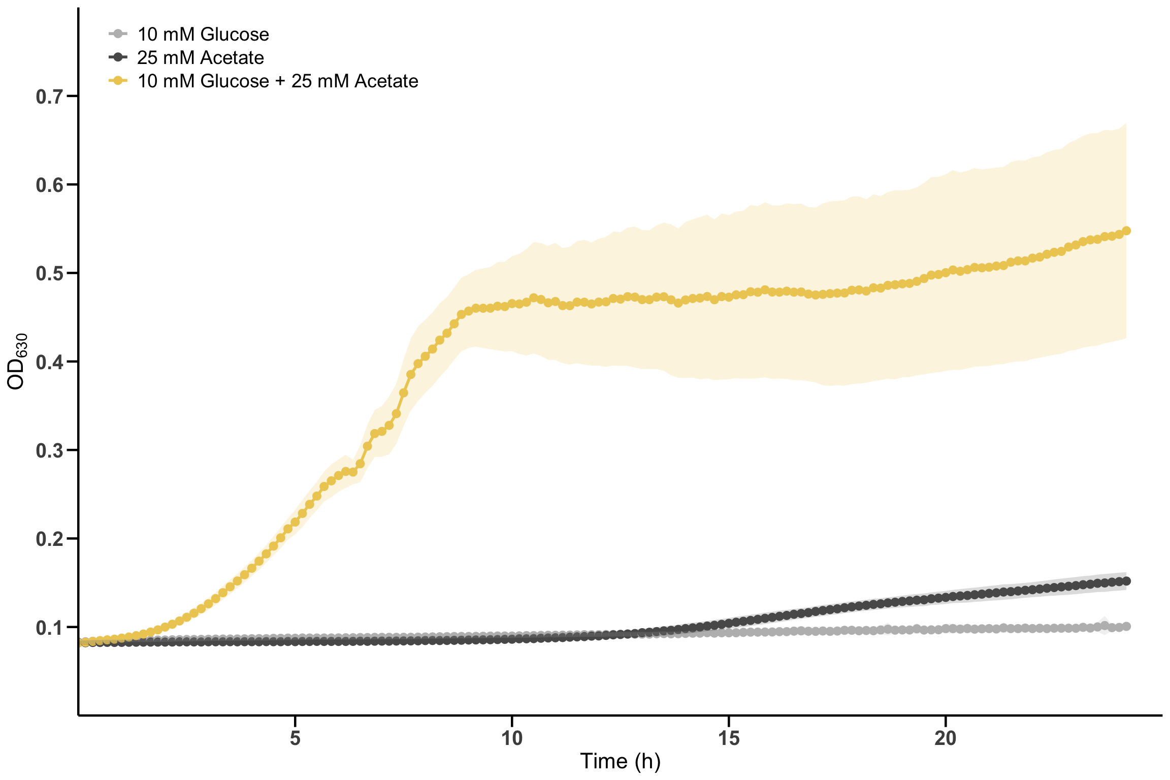
Now we can create the plot using ggplot2.
# Define colors for the metabolites.
metabolite_colors <- c("10 mM Glucose" = "#bcbcbc",
                       "25 mM Acetate" = "#595959",
                       "10 mM Glucose + 25 mM Acetate" = "#eecc62")

p_fig2c <- fig2c_data_clean %>%
  ggplot(aes(x = time_h, y = od600, color = condition, fill = condition)) +
  geom_line(linewidth = 1) +
  geom_point(size = 2.5) +
  # geom_ribbon for the shaded standard deviation area.
  geom_ribbon(aes(ymin = od600 - sd, ymax = od600 + sd, fill = condition), alpha = 0.2, color = NA, show.legend = FALSE) +
    scale_color_manual(values = metabolite_colors) +
    scale_fill_manual(values = metabolite_colors) +
  # Put titles to the axes and adjust limits.
  labs(
    x = "Time (h)",
    y = expression(OD[630])
  ) +
  scale_y_continuous(breaks = seq(0.1, 0.7, by = 0.1), expand = c(0, 0), limits = c(0, 0.8)) +
  scale_x_continuous(breaks = seq(5, 20, by = 5), expand = c(0, 0), limits = c(0, 25)) +
  # Apply a basic theme and customize it
  theme_minimal() +
  theme(
    panel.grid = element_blank(),
    axis.line = element_line(color = "black", linewidth = 0.8),
    axis.ticks = element_line(color = "black", linewidth = 0.8),
    axis.ticks.length = unit(0.3, "cm"),
    axis.text = element_text(size = 15, face = "bold"),
    axis.title = element_text(size = 16),
    legend.title = element_blank(),
    legend.text = element_text(size = 14),
    legend.position = c(0.17, 0.93)
  )
Display the plot.