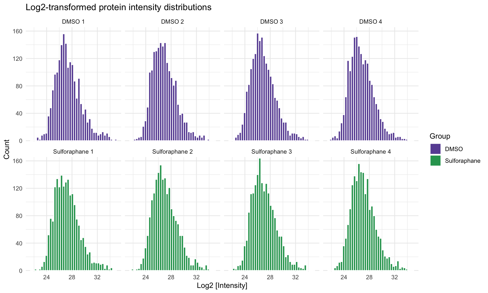
4.2 Plot the overall intensity distributions per replicate
Define colors for the labels. They will be used in multiple plots.
Plotting pipeline:
Format Reference names for better readability in the plots
Start ggplot, map global aesthetics (x axis and fill color)
Add histogram layer with 40 bins and white borders
Add labels and titles
protein_data_parsed_mut <- protein_data_parsed %>%
    mutate(Reference = case_when(
        Reference == "DMSO_rep1" ~ "DMSO 1",
        Reference == "DMSO_rep2" ~ "DMSO 2",
        Reference == "DMSO_rep3" ~ "DMSO 3",
        Reference == "DMSO_rep4" ~ "DMSO 4",
        Reference == "Suf_rep1" ~ "Sulforaphane 1",
        Reference == "Suf_rep2" ~ "Sulforaphane 2",
        Reference == "Suf_rep3" ~ "Sulforaphane 3",
        Reference == "Suf_rep4" ~ "Sulforaphane 4",
        TRUE ~ Reference
))ggplot(protein_data_parsed_mut, aes(x = Intensity, fill = Label)) +
geom_histogram(bins = 40, color = "white") +
labs(
title = "Log2-transformed protein intensity distributions",
x = "Log2 [Intensity]",
y = "Count",
fill = "Group"
) +
scale_y_continuous(expand = c(0.01, 0)) +
theme_minimal() +
scale_fill_manual(values = label_colors) +
facet_wrap(~Reference, scales = "fixed", nrow = 2)